

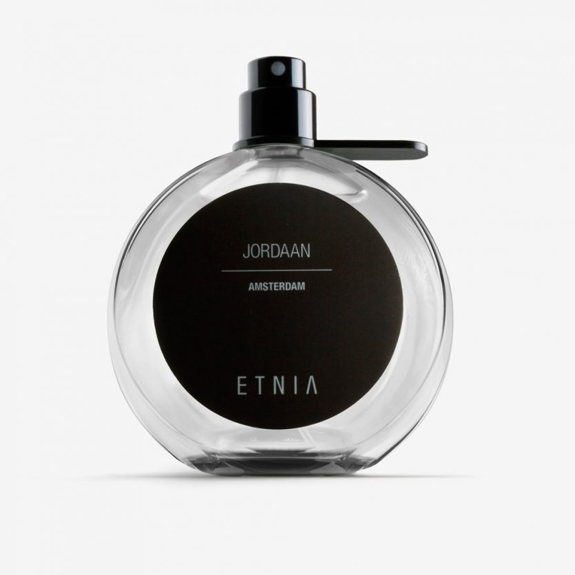
Etnia Fragance
The sense of smell has an extraordinary ability to evoke memories, and there is little we enjoy more than reminiscing about trips to our favourite cities. Etnia’s Fragrance Collection is dedicated to the trendiest neighbourhoods of some of the world’s most iconic cities—from London’s well-known and vibrant Brick Lane to Beijing’s unexpected and avant-garde 798 Factory.
Neighbourhoods and streets that set trends worldwide served as the inspiration both for the creation of the fragrances and for the design of their packaging, from structure to graphic language. The rounded bottles allude to the global nature of cities and to the idea of travel, while also functioning as a magnifying glass that enlarges the map of each neighbourhood, visible through the glass from inside the bottle and on the reverse of the label.
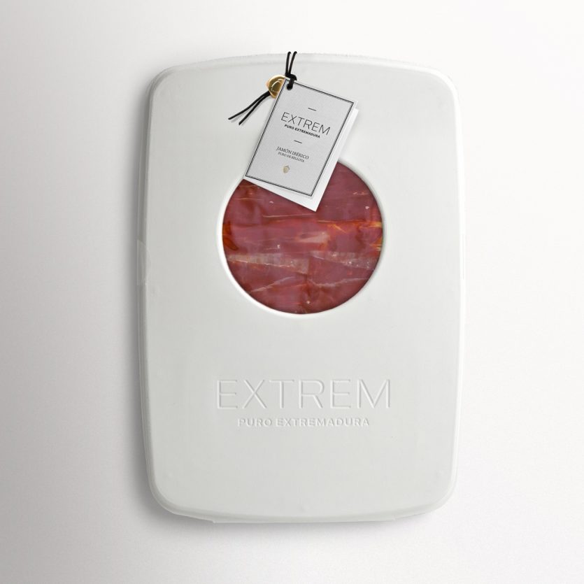
Extrem Premium
Extrem is a new brand of Iberian ham made from free-range, acorn-fed Iberian pigs. The company aspires to position itself among the leading brands in its category and, to achieve this, required innovative packaging for its sliced ham—something clearly differentiated from its competitors.
Most competing products are sold in food stores and gourmet shops, typically packaged in cardboard or even tins. As a premium-quality product with a corresponding price positioning, Extrem needed packaging that reflected its value. The challenge lay in standing out without increasing costs. Our response was to explore alternative shapes and materials that remained within budget while being unmistakably distinctive.
At L&C, there is an approach we particularly value: introducing materials or features drawn from other sectors, far removed from the conventional “universe” of the product at hand. This led us to consider moulded cellulose pulp—a material commonly used for egg packaging and for protecting fragile electronic devices. It is a humble material, free from preconceived semantic associations.
When produced in large quantities, cellulose pulp offers a very low unit cost. With this, we had our proposal for Extrem: a packaging solution that stands out for its innovation and visual identity, while also offering clear advantages in terms of cost and sustainability. The material itself functions as a hinge, allowing the package to be formed from a single piece. It incorporates a mandatory circular window—essential for displaying the ham—created directly in the mould, as is the brand engraving, eliminating the need for any additional printing process. The pack is closed with a simple piece of string, a traditional element closely associated with the curing and presentation of ham.
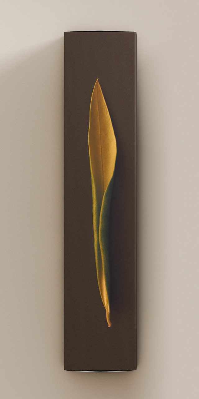
Vegamar Selección
Wine is grapevine and time. On the one hand, grapes grow and mature slowly; on the other, months of winemaking through a delicate craft give rise to a process that is inherently unpredictable. The idea behind the identity of Vegamar Selección—a dedicated space for tasting and purchasing select wines, cava, olive oil, and other Vegamar products—emerges from the combination of the vine leaf and the passage of time.
Vine leaves were collected and photographed as they began to dry and curl in on themselves, each one doing so in a unique way. This natural transformation mirrors the wine ageing process, which also contains an element of chance and an unpredictable beauty. The visual identity of the store is built around these images, treated in monochrome, and has been applied across gift packaging as well as wine, cava, and olive oil labels.
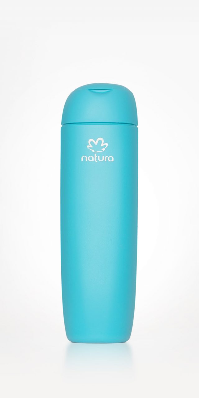
Natura Tez
Natura is a highly regarded cosmetics and fragrance manufacturer and a market leader in Brazil. The company is also strongly committed to social development, with a particular focus on the Amazon region and on improving the living conditions of local communities, while promoting the sustainability of its natural ecosystems.
Over the years, Natura has also become a benchmark for quality design, as evidenced by its impressive headquarters in São Paulo, its refined product design, and its creative communication campaigns. In this project, the brand sought a design that would communicate the simplicity of a line aimed at women looking for a practical, accessible, and uncomplicated product. At the same time, the brief specifically called for an organic, feminine, and contemporary feel.
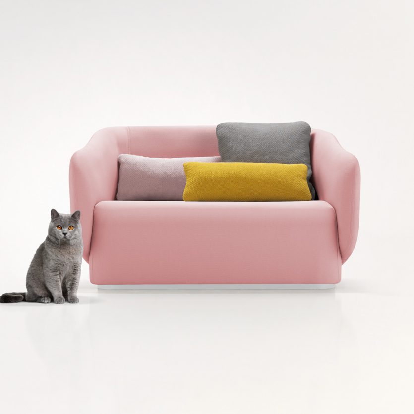
Yon
Produced in different lengths, this sofa is the centrepiece of a collection—comprising a chaise longue, armchairs, and other pieces—designed for both domestic and commercial use. The armrests form part of the backrest and open outwards in a welcoming gesture. Square and rectangular cushions introduce colour compositions that contrast with the neutral upholstery background.
Papel Elefante
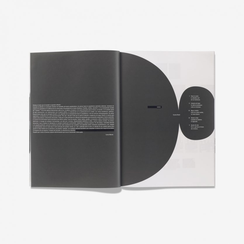
In 2000, an alternative cultural space was created in Valencia where painting, sculpture, design, photography, jazz, classical music concerts, and other disciplines coexisted. A place conceived to promote the latest cultural trends, it was named Color Elefante. To complement the gallery, the magazine Papel Elefante was launched, focusing on art, literature, and related fields.
Each issue of the magazine is designed by a different designer, and we were commissioned to develop issue no. 3. To give the publication a clear visual focus, we placed white text within dark grey rounded forms, creating a strong visual impact. This approach gives greater prominence to pages where text is the sole visual element, enabling it to hold its own alongside pages featuring paintings, drawings, or sculptures, which are inherently more visually expressive.