

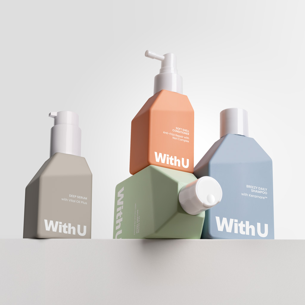
With U
The client intended to launch a high-performance vegan haircare line aimed at a young audience aged 16 to 30, whose hair and scalp are increasingly affected by the use of heat styling tools, colouring, stress and hormonal changes.
The line begins with four daily-use products formulated with natural marine ingredients. The brand needed to be eye-catching while also communicating efficacy and scientific backing.
We chose a modern, striking typeface for both the logo and communications in order to convey strength and clarity. The colour palette is appealing but carefully selected—avoiding overly saturated or childish tones—to achieve a balance between visual appeal and credibility.
The bottle design is both iconic and functional: its straight lines and angled planes evoke technology and precision, while its unique profile ensures brand recognition. The flat surfaces allow the bottles to be aligned or stacked, creating strong visual impact on shelves and in campaign imagery.
The embossed logo on the back panel adds a high-quality tactile detail, while the soft-touch finish of the bottles enhances the sensory experience and reinforces the brand’s care-focused positioning. Aware that bioplastics are not the perfect solution, we chose sugarcane-derived polyethylene for the packaging, combining sustainability and performance.
Beauty photography: Cartulina
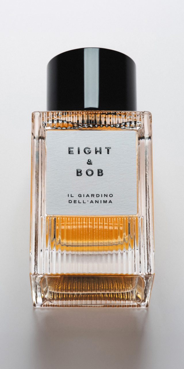
Eight & Bob
Eight & Bob is a niche fragrance brand with a story rooted in the elegance of the 1930s. It was born from a chance encounter on the French Riviera between French perfumer Albert Fouquet and a young John F. Kennedy, who became enamoured with Fouquet’s personal fragrance. Kennedy’s later request for “eight bottles—and one for Bob” inspired the brand’s distinctive name.
Today, Eight & Bob is internationally renowned for its refined character and timeless appeal. When they approached us, they were looking for a new bottle design to embody their essence: savoir-faire, understated luxury, and a touch of modernity. The brand evokes a sophisticated lifestyle with aristocratic overtones.
The design draws on a contemporary interpretation of Art Deco, connecting visually and conceptually with the brand’s heritage.
The thick, transparent glass features a ribbed surface that adds texture and plays with light, evoking the ornamental codes of the era. Its bold, symmetrical silhouette conveys clarity and strength.
A glossy black cylindrical cap crowns the bottle. Once removed, it reveals a metal collar engraved with the collection’s name: Fouquet Collection. A subtle, ritualistic gesture that enhances the sensory experience.
The secondary packaging—a white box wrapped with a coloured band—distinguishes each fragrance. Opening the box is like unfolding a book, one that tells the story of the brand.
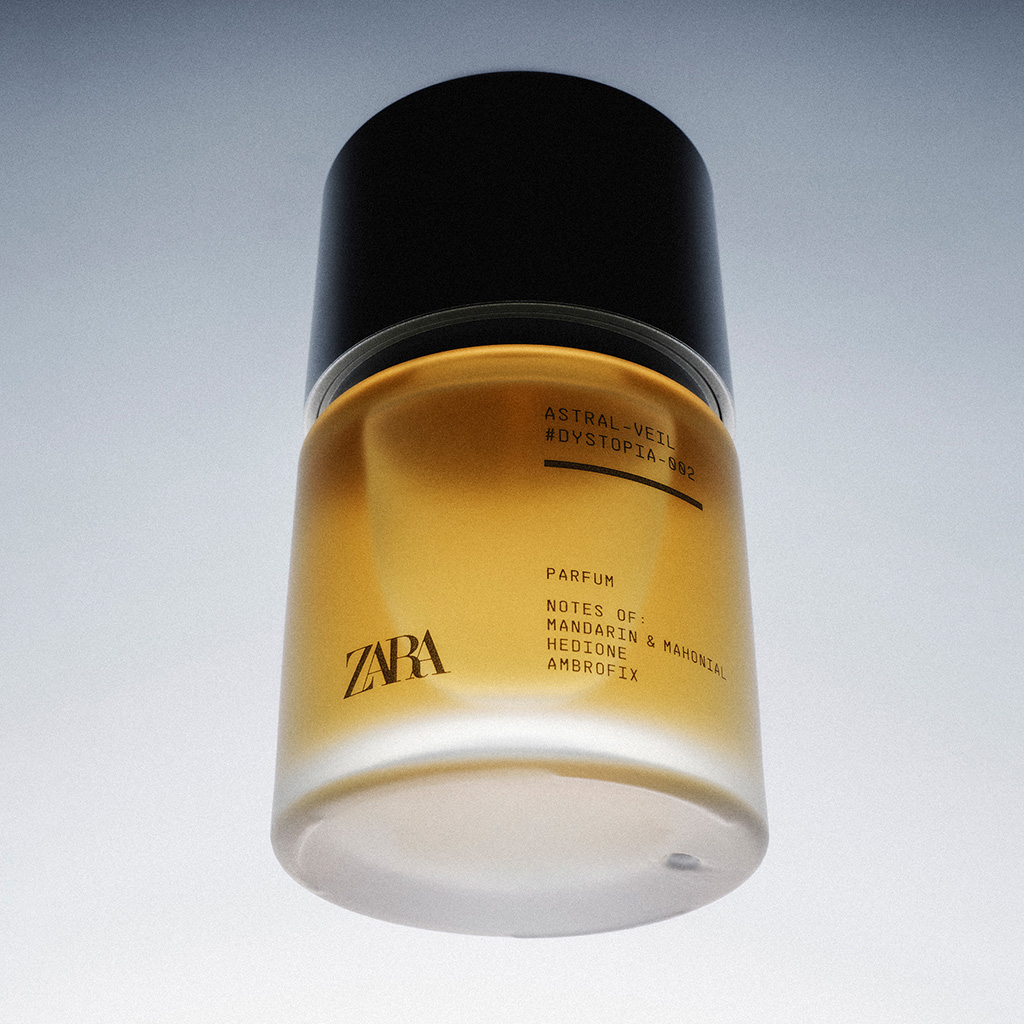
Zara Dystopia
Zara commissioned us to design the packaging for the “Dystopia” perfume collection, covering both the bottle and the graphic identity of the range.
Dystopia presents a bold vision of men’s perfumery, in which innovation takes center stage. Each fragrance is built around a single synthetic note capable of evoking a natural element, in an exercise in contemporary alchemy. The brief called for the entire project to convey a scientific, almost laboratory-like atmosphere.
The design is structured around a sober and restrained formal language. The bottle adopts cylindrical volumes with compact, almost technical proportions, softened by translucent surfaces that filter the color of each fragrance. The matte aluminum cap reinforces this technological aesthetic.
The graphic design, in keeping with the overall concept, incorporates visual codes drawn from the laboratory and industrial interface: monospaced typography, visible grids, hierarchical information, and an austere composition that visually translates the logic of the concept. As a whole, the system conveys control, precision, and contemporaneity, in harmony with a perfumery conceived for a post-natural setting.
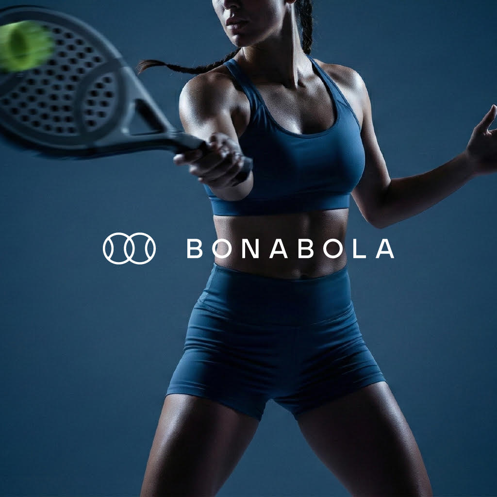
Bonabola
The client needed to develop the entire identity for a brand of padel-related products: naming, logotype, packaging, etc. It was conceived as a contemporary brand, with the ambition of moving away from the aggressive and overloaded visual codes that dominate the sector. The aim was to create a distinctive identity that would position the company as a modern, precise and product-focused brand.
The project is built around a clean and essential system. The symbol, inspired by the intersection of two balls, refers to the fact that padel is always played in pairs, while the name BONABOLA connects the brand to its place of origin, as it means “Good Ball” in Valencian.
The logotype uses a sans-serif typeface whose inner corners have been rounded in the same way as the joints in the symbol’s strokes, while the increased letter spacing gives the whole a harmonious rhythm that conveys elegance and personality. The colour palette combines understated greys with a vibrant yellow that brings energy and a distinctive character of its own.
The art direction is based on a minimalist aesthetic, with restrained compositions and neutral backgrounds that emphasise the product’s technology. The result is a brand that conveys precision, performance and confidence.
The project also included a Brand Manual with precise guidelines for applying the identity across a wide range of media, including rackets, clothing, advertising, accessories, and the brand’s presence on the website and social media.
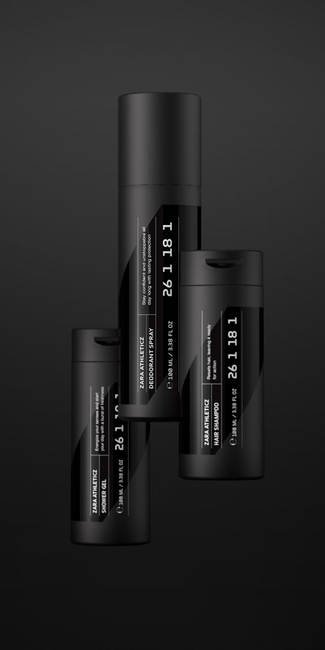
Zara Athleticz
Zara Athleticz, Zara’s menswear sports line, set out to launch its first body care collection: an essential range designed to accompany daily activity and adapt to an “on the go” lifestyle. The challenge was to translate the brand’s visual codes into packaging, maintaining strict coherence with its typographic and chromatic identity.
The proposal is built around a clear system. Black identifies everyday products; white is reserved for those intended for outdoor use with sun protection. This chromatic duality organizes the range and enables immediate recognition.
The brand’s iconic “slash” becomes the key graphic element. Enlarged as a background device, it introduces dynamism and structure to the whole. Information is arranged vertically and organized with fine lines, evoking a technical, high-performance universe in tune with Athleticz garments.
The contrast between matte and gloss finishes, together with the use of screen-printed inks, reinforces the sense of precision and quality.
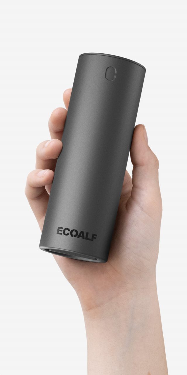
Ecoalf Wellness
Ecoalf is a Spanish sustainable fashion brand that uses fabrics and materials made from plastic waste collected from the sea. In 2022, the brand decided to launch a personal care line. It was clear that this new range had to align with Ecoalf’s environmental commitment and positioning. Our involvement went beyond packaging design: we participated from the outset in product concept and development, working closely with the marketing, production, and formulation teams to identify the most environmentally responsible solutions.
The result is a line of multifunctional products made with eco-friendly ingredients and processes, including solid and powder formats that eliminate the need for water. By removing water from the formulations, both weight and CO₂ emissions during transportation are significantly reduced. This approach allowed us to dispense with plastic bottles and opt for lighter, more sustainable packaging. All products are designed to be used with specially developed reusable aluminium containers. The packaging—both for the aluminium containers and for the products themselves—is made from eco-friendly materials, including recycled cardboard, compostable pouches, and cellulose pulp. Graphics play a key communicative role, explaining the purpose and functionality of each item and of the range as a whole, making it easier for consumers to make environmentally conscious choices.
For this launch, Ecoalf partnered with RNB, a cosmetics group with a pharmaceutical background and more than 30 years of experience in the sector.
According to a study conducted by the technological institute ITENE, the range achieves a 74% reduction in CO₂ emissions and a 70% reduction in water consumption compared to equivalent conventional products over one year of use.
Photography: L&C, Ernesto Sampons, Daniel Molina