

Naranja Valenciana
The task was to create a brand to promote, commercialise, and sell the finest Valencian oranges and tangerines. It needed to be contemporary, young, fresh, and powerful.
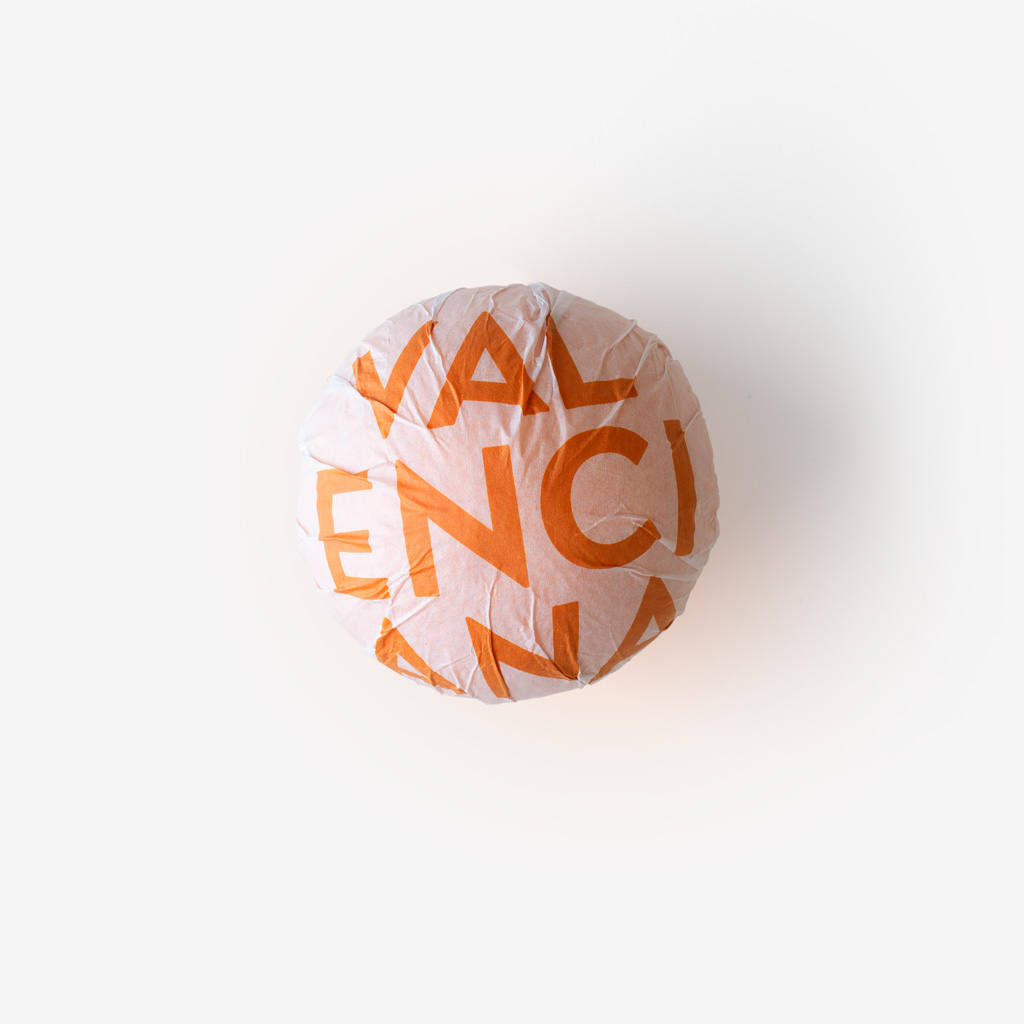
Three key applications were identified due to their relevance at the point of purchase: the sticker placed directly on the fruit, the mesh, and the boxes.
A logo with strong visual impact and immediacy was required—recognisable, versatile, and easy to apply—capable, on its own, of clearly conveying that these oranges and tangerines come from Valencia.
The solution was the creation of a symbol: an orange circle—an iconic representation of the fruit itself—containing the word VALENCIANA. This symbol works equally well for both oranges and tangerines.
It is accompanied by a wordmark with ascenders and descenders, set in a typeface that does not compete with the symbol, ensuring clarity and legibility even on decontextualised applications where the fruit is not present.
Piel·e
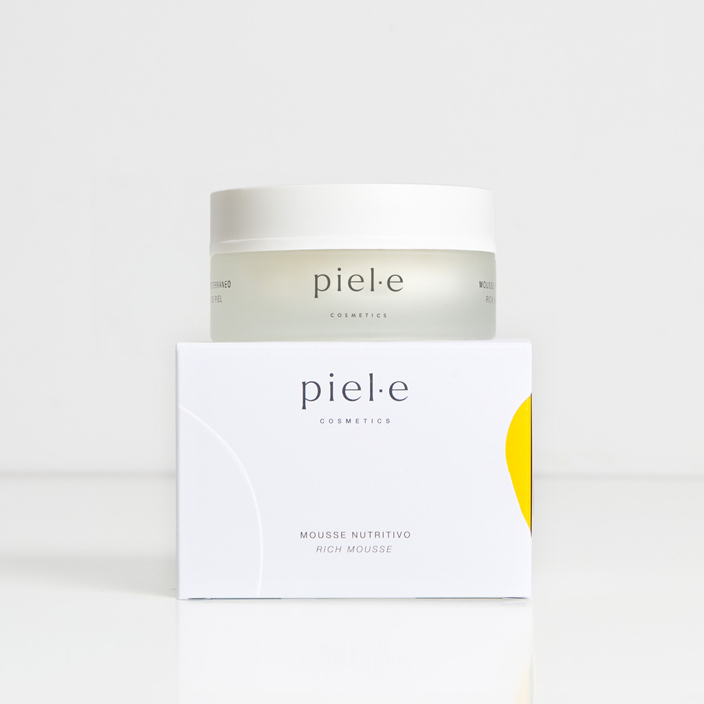
Piel·e is a cosmetics brand created with the intention of using ingredients sourced from Spanish agriculture that embody Mediterranean culture. It is aimed at individuals who wish to be part of a responsible and sustainable shift within the cosmetics industry.
We designed the logo using the Larken Thin typeface, a lowercase font with carefully balanced kerning whose stability, nuance, and expressiveness convey a sense of reliability and closeness.
In the packaging design, we sought to express the brand’s core personality traits. Elegance is conveyed through the predominance of white backgrounds and a refined typographic composition. Sensoriality is introduced through an organic die-cut shape that reveals the colour inside the box—yellow in this first range—combined with a raised design that interacts with it. The primary packaging, made of translucent glass, further reinforces these sensations of softness and sensoriality, which lie at the heart of this premium brand.
Pancracio
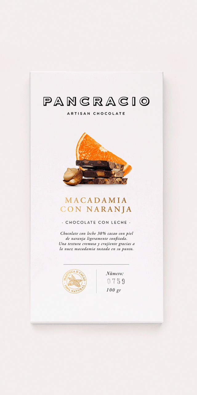
Pancracio was a small, local chocolate company with a presence in very exclusive shops. In this new phase, the aim was to grow and reach broader markets without compromising its premium positioning and quality. All elements of the packaging and graphic system were analysed in depth in order to determine which should be retained and which should be updated.
The decision was made to preserve the logo, valued for its strength and distinctive character. White backgrounds were introduced to allow images and text to breathe, alongside a centred composition in which information hierarchy and balance play a key role in conveying confidence. Carefully selected product photography completes the visual language.
The result is packaging that is both elegant and approachable, with particular attention paid to the unboxing experience—making it especially suitable as a gift.
Valencia Tourist Brand
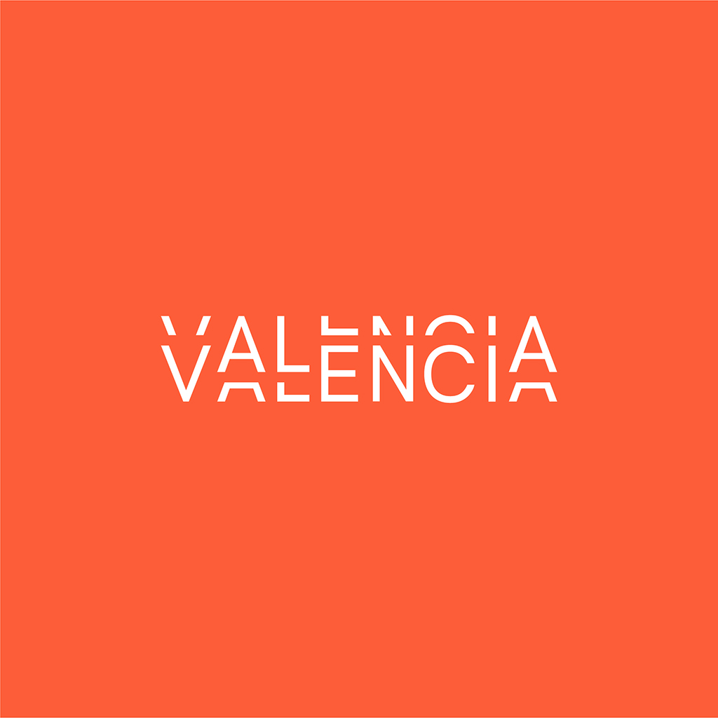
This logo communicates the idea of Valencia as a dynamic, open, and modern city—vibrant and alive with energy (brand concept developed by the Weaddyou agency). It does so through a graphic device drawn from the world of illustration and comic strips, where parallel lines follow the outline of a figure to create a sense of vibration. In this case, the device is applied to typography.
Although it is a tourism brand, preliminary studies and surveys revealed that it should not focus solely on conventional sun-and-beach tourism. Valencia is also a major city with strong economic, cultural, and infrastructural conditions for hosting conferences, as well as cultural, professional, and business events.
For this reason, we designed a logo in which movement and vibration are present in the letterforms, yet contained within a rectangular frame—a compact shape that conveys strength and solidity. At the same time, the result is sufficiently unique and distinctive within the field of city branding to be easily recognised and remembered.
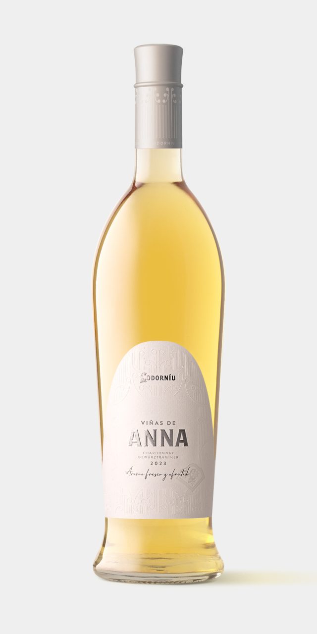
Viñas de Anna
The task was to redesign Viñas de Anna, a wine originally launched in 2015 that Codorníu had decided to update. We began with an iconic bottle design that reflects the attributes of the wine: delicate, feminine, bright, luminous, fresh, and full of personality.
Our inspiration came from elements of the winery’s modernist architecture, designed by Puig i Cadafalch. The label’s die-cut echoes the building’s characteristic parabolic arches, while the embossing reproduces fragments of its ornamental details. The overall composition, typographic treatment, choice of paper, and the use of stamping and embossing provide the delicacy and elegance required by the brief.
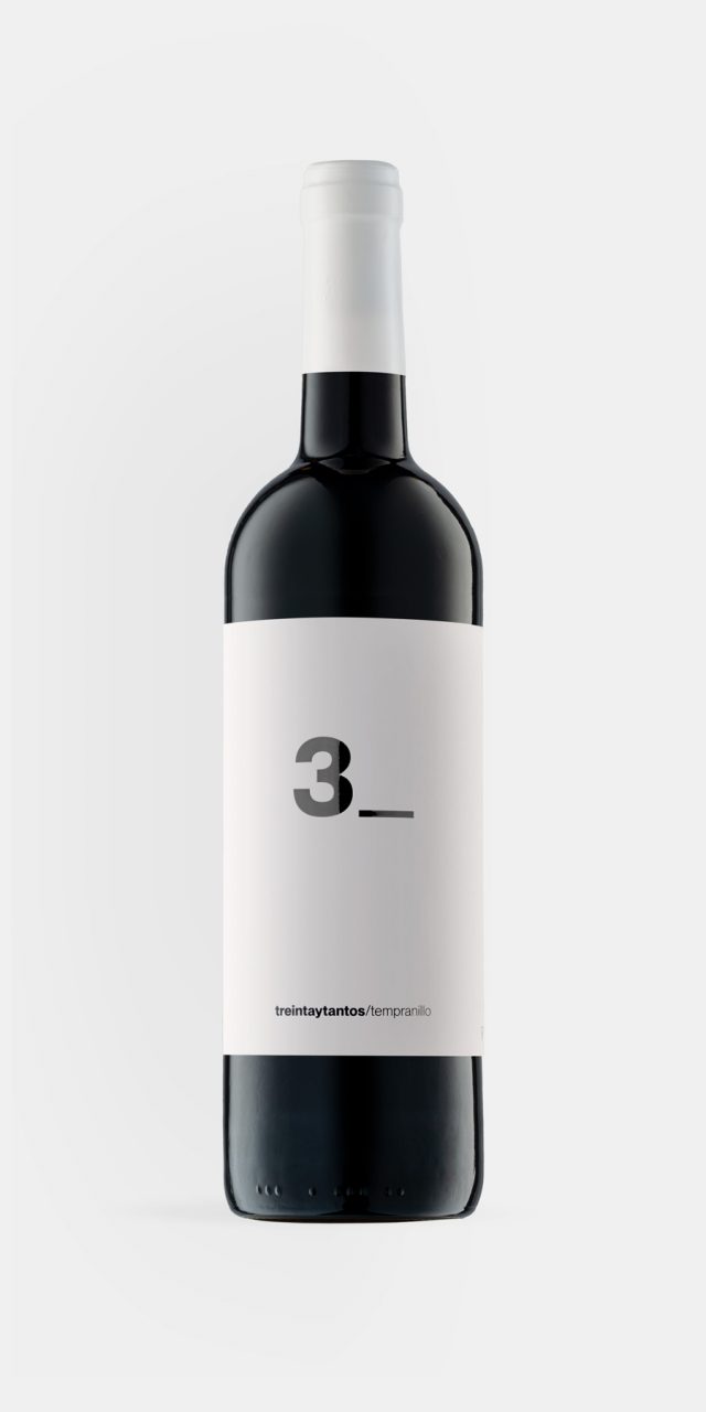
Treintaytantos
It is often from the age of thirty onwards that people begin to drink and truly appreciate wine. It is as though a more mature stage of life has been reached—one better suited to the calm and tranquillity required to enjoy it. This idea is the origin of the wine’s name, as well as the starting point for the label design, conceived as a way of representing this ambiguous notion of being thirty-something.
The underscore _ is an invitation to complete what is missing. When a form asks someone to fill in information, an underscore is commonly used. We chose to place only 3 on the front of the label, die-cut into white paper, allowing the wine itself to provide the colour.