

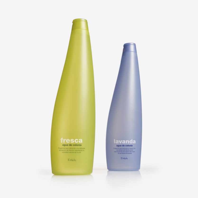
Deliplus Fresca y Lavanda
Bottle and graphic design for two mass-market colognes distributed nationwide through Mercadona stores. The 750 ml bottles are made from coloured translucent plastic. A contemporary design with a subtle air of sophistication.
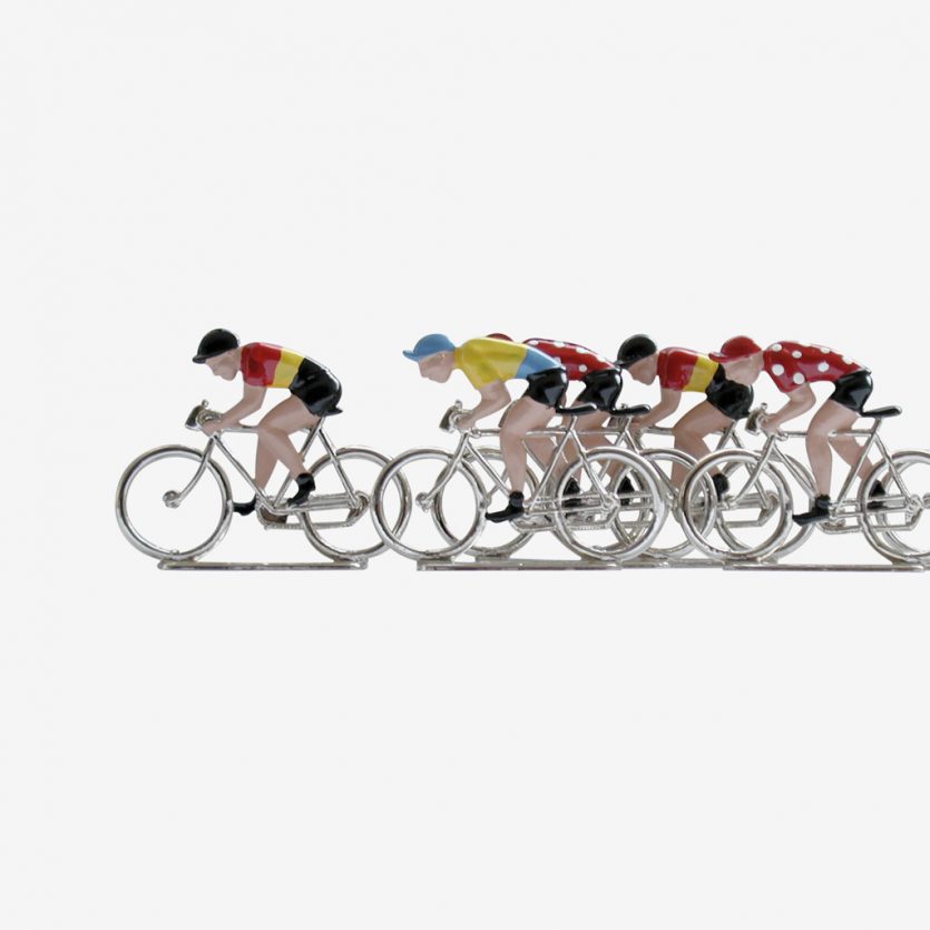
El Juego de los Ciclistas
The idea was that the board game should not resemble a conventional one. We wanted to avoid the graphic attributes typically associated with board games. There were two reasons for this: first, the game is aimed at a specific audience who recognise these cyclists from their childhood; and second, as it includes fifteen hand-painted lead miniatures, it could not be mistaken for a children’s game.
The materials used — cardboard, paper and wood — together with the rubber-stamp typography, give the game a natural, tactile quality, deliberately avoiding the appearance of an "overly designed” product.
Play the game!
Los Ciclistas — www.losciclistas.com
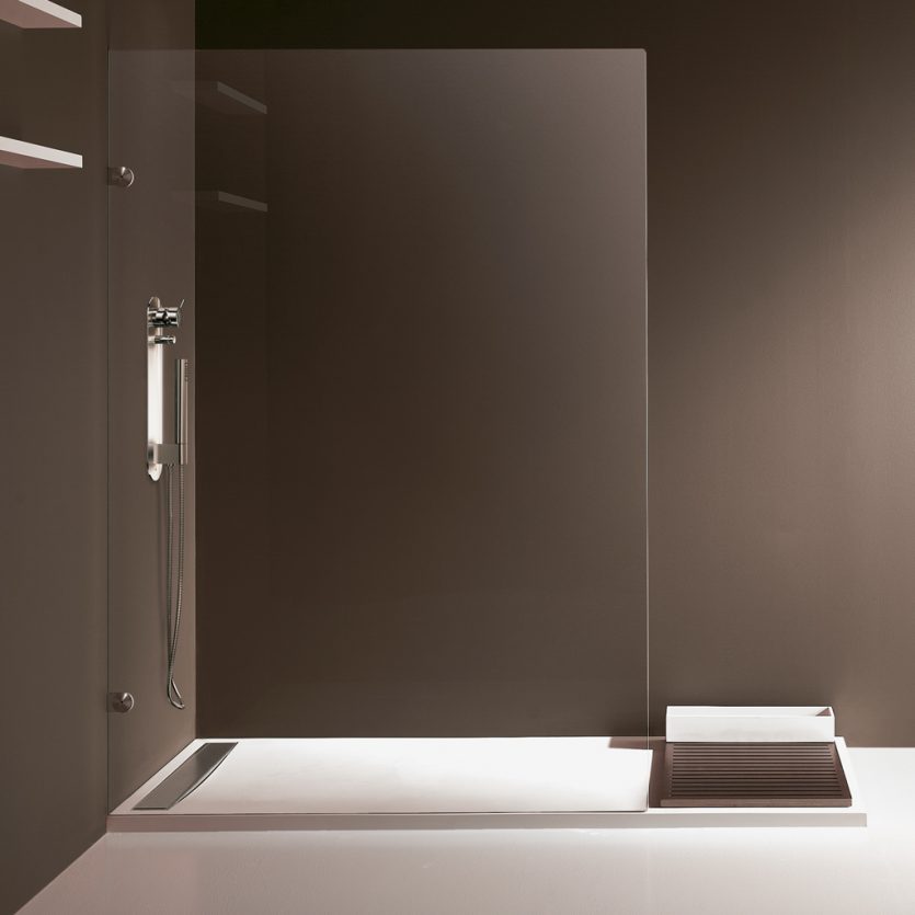
Bonjour
A basic requirement of the design was that it should fit a standard-sized shower tray. The tray rests on a flat base specifically designed for this purpose. Its inner surface has a slight incline that directs the water towards a concealed stainless-steel drain.
The shower tray has been designed to be sufficiently thin to allow installation either on top of the floor or flush with it. Two complementary elements were also designed: a wooden drying platform and a container for shower accessories such as bottles and sponges. The container is made from the same materials as the shower tray — Stonefeel® and natural stone — and is available in two standard sizes: 80 × 130 cm and 80 × 180 cm, with the option of customisation to any length between 130 and 180 cm.

Parc Cientific
Identity design for Parc Científic de la Universitat de València. The project brings together companies, research centres and university departments with a shared objective: to foster innovation by transforming scientific knowledge into technology, and technology into services that are useful to society.
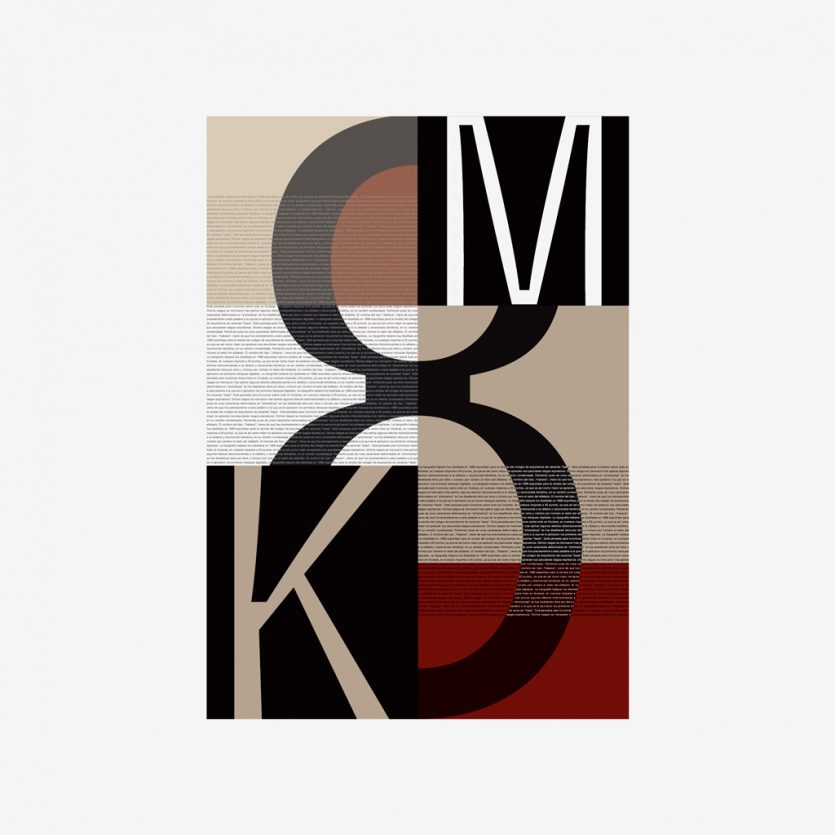
Habana poster
Poster for the typography exhibition "Vaya tipo". We used Habana typeface, combining small and huge sizes in positives and in negatives.

I-Plash
L&C were commissioned to design the mascot for the 10th World Swimming Championships, held in Barcelona in 2003. The mascot’s form needed to reference water and the activities associated with the sport. As is characteristic of mascots, the design is conceived to be emotional, capable of generating empathy and affection.