

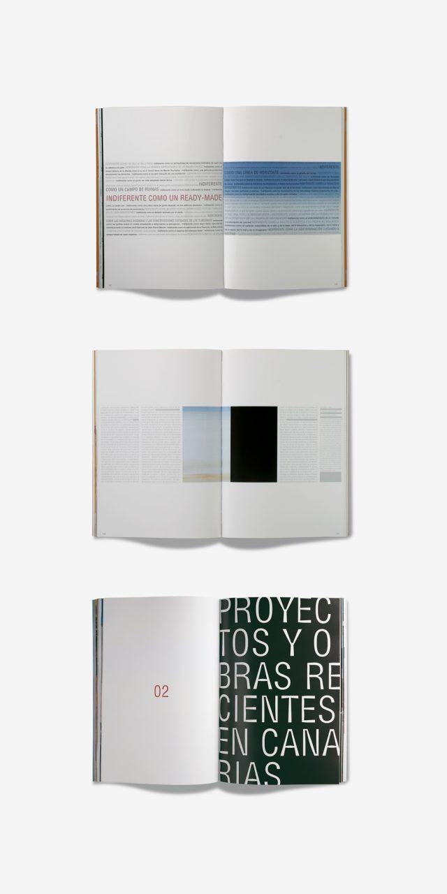
Basa
For two years we produced the design for BASA magazine, the official magazine of the Canary Islands Official College of Architects.
www.coactfe.org
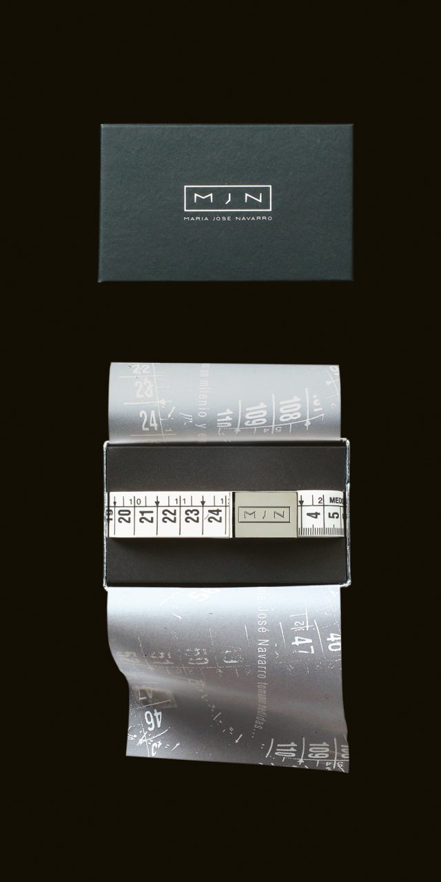
Maria José Navarro
The design’s aim is to be efficient at communicating the key brand attributes. For the design, we took into account the characteristics and circumstances of the client. The logo agrees with the elegance and austerity of Maria Jose Navarro’s style as a fashion designer. It consists of a simple typeface of sharp features in black and white colours, that follows the brand style and that can be easily adapted to labels, bags, lettering, etc. Since 1996, we have also designed displays, post cards, press dossiers, and more.
In collaboration with Sebastián Alós and Eva Benedito.
In collaboration with Sebastián Alós and Eva Benedito.
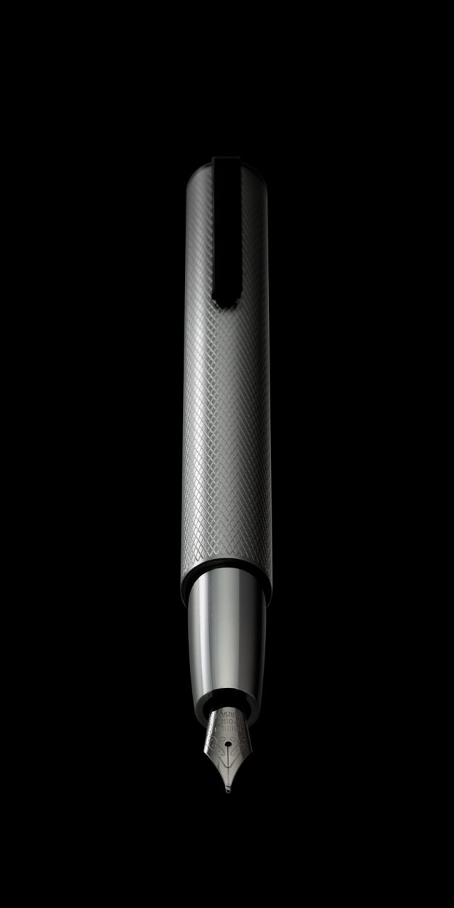
Tizona
Much has been written about the power of words. Their ability to change things, to oppose injustice, to triumph over the weapons, violence. When we started designing this pen the concept of the sword and its sheath came to mind. We liked the image of the pen as a sword. Like a Tizona, the long-sword of El Cid, or Arthur’s Excalibur, ready to challenge the injustices of the world. The design contrasts the two main parts of the pen. The cap, determined as a cylindrical sleeve, knurled, very powerful and inside the body, sharp, smooth, shiny. All in shining chrome.