

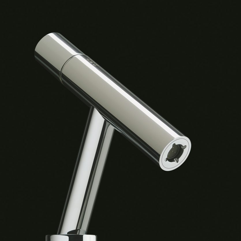
Metro
Sanico asked us to design a range of faucets with a neutral appearance, capable of fitting a wide variety of washbasins and other bathroom products on the market, and in particular their own collections. The result is Metro: a faucet defined by the intersection of two cylinders, integrating the two key functional elements — the temperature-control handle and the aerator filter. The latter is completely concealed and can be easily dismantled for cleaning.

Alfaro Hofmann
To design the identity for Alfaro Hofmann, we drew on photographs of his unique collection of electrical appliances and paired them with an avant-garde typeface that evokes the golden age of small domestic appliances.
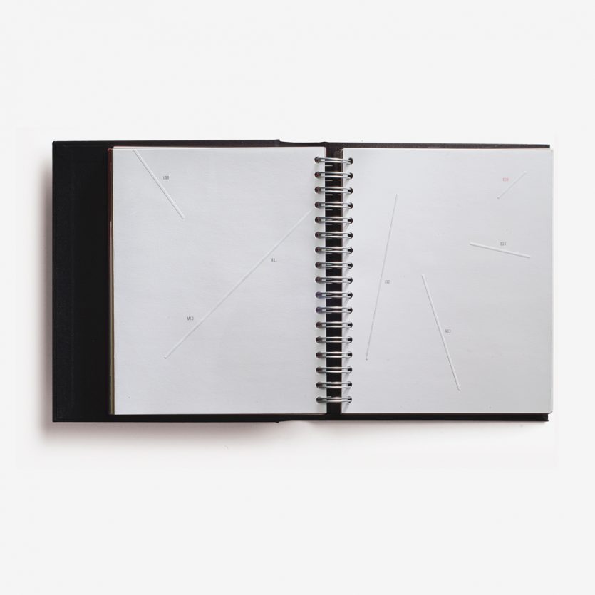
Agenda Vernetta
We designed some pages (June) for the 2003 edition of the Vernetta diary (specialised printing company). They consist of colourless, irregular lines, almost non-existent, which define the random time and space of each working day. The absence of elements on the pages, thanks to an almost immaculate white, conveys the idea of a future yet to be written.
www.graficasvernetta.com
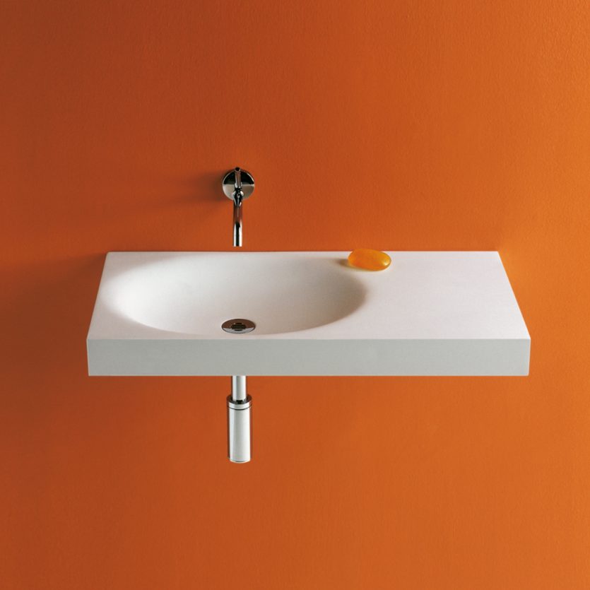
City Washbasin
A one-piece washbasin designed to be placed on a cabinet or wall-mounted. Two symmetrical models in which the basin appears as an erosion carved into a perfect prism. The bowl is offset to one side in order to maximise the usable surface for accessories. The product is manufactured in Stonefeel® (mineral resin) and natural stone.
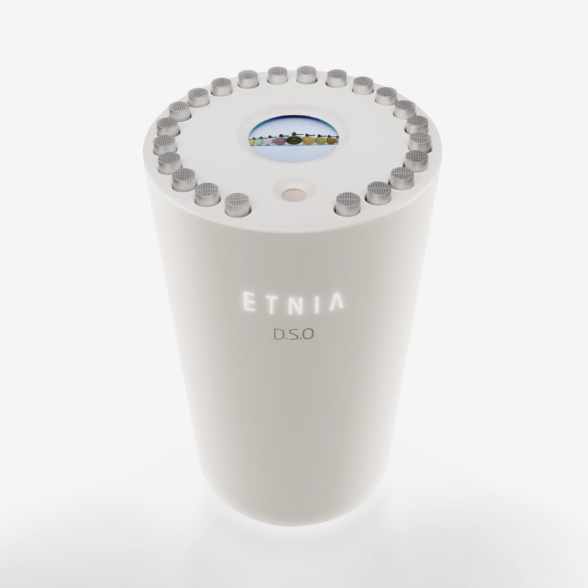
D.S.O. Etnia
D.S.O. (Olfactory Sensorial Device) is a new shopping experience for purchasing perfume. It is a device designed exclusively for the Spanish cosmetics brand Etnia, featuring an interactive screen that allows users to smell a selected fragrance while simultaneously receiving information and images about it.
The D.S.O. contains aluminium capsules housing the 19 fragrances available in Etnia stores. Users select and insert a capsule into a designated slot, where it is detected by a barcode reader, activating a fan that releases the aroma of the chosen fragrance.
During this process, an internal processor sends relevant information to the screen, allowing users to indicate their personal preferences and even receive fragrance recommendations based on their tastes.
The D.S.O. is a unique concept within its market, offering a combined audiovisual and olfactory shopping experience that makes the purchasing process more reliable, enjoyable and efficient.
Concept and design: Lavernia & Cienfuegos
Development and production: Prodiseño
Babé
As Babé initially began selling exclusively through pharmacies, we proposed a graphic language for both the brand and its packaging that balanced pharmaceutical (scientific) codes with cosmetic (stylistic) ones. It was also essential to distance the brand from any infant-related connotations that the name might inevitably suggest.
For this reason, we opted for an uppercase typeface, creating a compact and professional block in which the accent mark is contained within the text box, ensuring that nothing overflows and that the composition remains controlled, precise and clearly defined.