

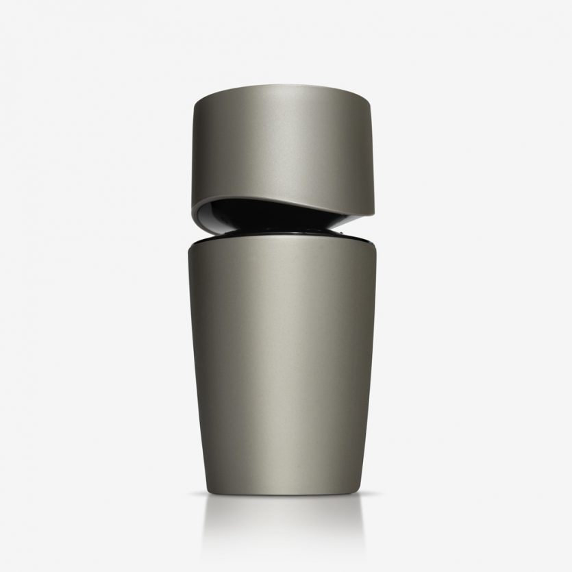
Codizia Man
Codizia Man is a men's fragrance from the same brand which was launched three years ago for the female market. It shares the same quality product positioning differentiation, and has a much lower price than high-end colognes. The packaging communicates similar attributes: sensuality, elegance, dynamism... It does this following the same language and some of the characteristics of its female predecessor, as in the solution for the join between body and cap, but with changes that reaffirm its male personality: the colours and the volume, which moves from a horizontal to a vertical position for Codizia Man. It is distributed exclusively at supermarket chain, Mercadona.

CDICV
This identity posed the challenge of working with multiple initials that were difficult to read and pronounce, as well as a lengthy title that was hard to recognise and memorise. The proposed solution sought to turn necessity into virtue by responding to a typographic problem with a typographic solution.
To address the initials, we developed a functional composition that prioritised readability and recognition. The result is a compact unit in which both the initials and the full name are integrated into the logo itself. Stable and powerful, the mark works effectively in white or black against colour. Its neutral, timeless character conveys the sense of standing and rigour required by the brief.
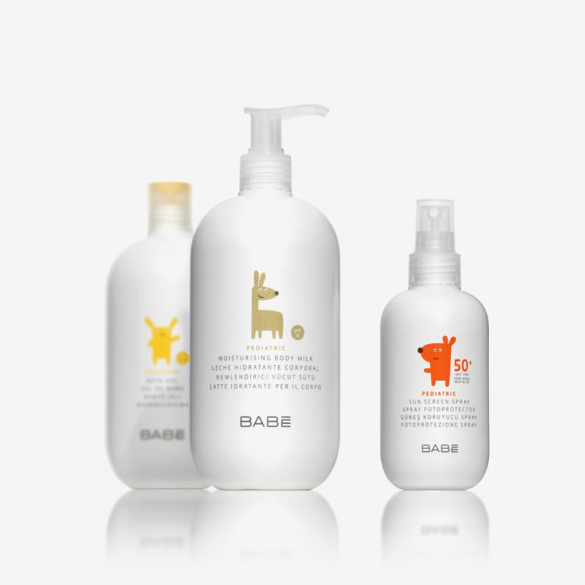
Babé Pediatric
This children’s range has been designed in line with the full Babé product portfolio, using illustrations created specifically for this project. The design responds to a dual objective: clearly identifying the three sub-ranges while also expressing the character and coherence of the overall range.
Illustration: Juan Antón.
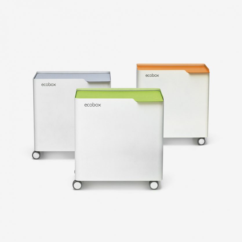
Ecobox
It is increasingly common for contemporary kitchen designs to incorporate built-in solutions for waste sorting and recycling. However, there are still millions of homes whose kitchen furniture does not include such systems, leaving bags of recyclable waste without a designated place.
Ecobox is a simple metal container designed to address this need. It allows the use of any type of plastic bag and enables the interior space to be divided according to specific requirements. The design has also been conceived for semi-public environments such as offices and waiting rooms.
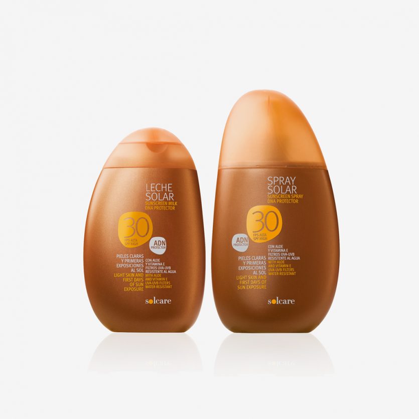
Solcare
Design of the bottles and graphics of a sun cream sold by the distribution chain MERCADONA. The shapes of the bottles are inspired by the stones of the beaches. The line has a total of 40 products.
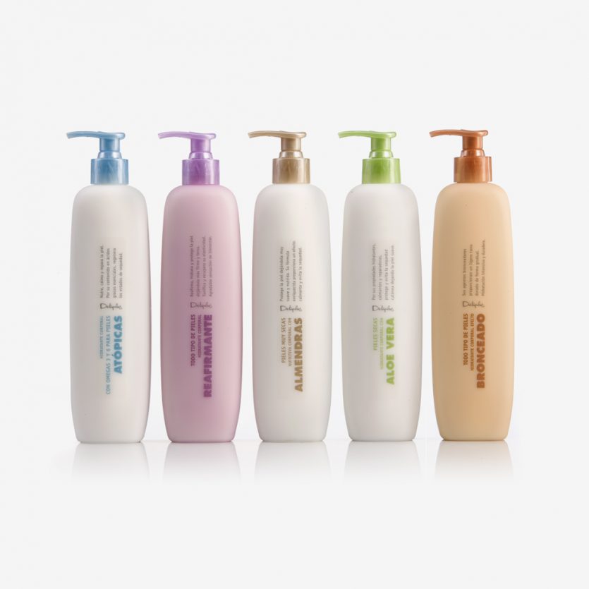
Deliplus Body Milk
We designed the bottles and graphic for the body milk line at distribution chain Mercadona. The bottles (400ml) are made of blowed coloured PE, with a translucent soft-touch finish. We looked for soft and rounded shapes, nice to touch, and a simple but powerful graphic design.