

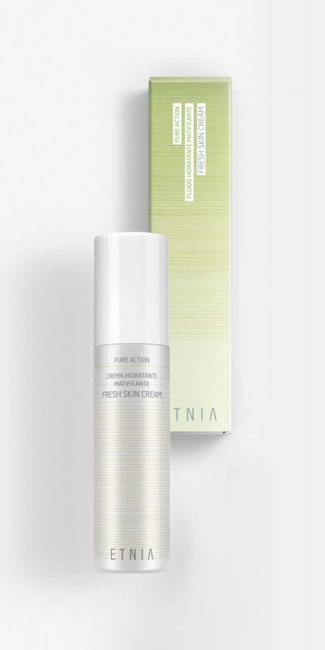
Etnia Skin Care
ETNIA Cosmetics brand has a clear objective: To open a network of stores in Spain and to repeat the same strategy at international level. It is a global design project: brand, packaging, POS, web and communication at point of sale. It was decisive to begin defining the brand positioning and attributes, and then to translate them into a visual language in such a way that the brand personality is always present. ETNIA make-up and treatment lines include more than 200 references. It was a project which required the consolidation of a bespoke design with standard bottles. A complex task resembling a jigsaw puzzle. Pieces from different suppliers have been selected, and materials, finishes and processes have been chosen, and applied, in such a way that the end result, composed of pieces from multiple suppliers with different resources, is feasible whilst keeping everything coherent and transmitting a consistent ETNIA personality. Make-up, which is a key product in ETNIA shops, is full of colour, lines and textures. The visual identity takes these characteristics as a starting point for its packaging design, which highlights the most representative attributes of each category, such as elegance and beauty. The result is a design which differentiates from the usual characteristics, visual cues and trends of other brands, resisting silver, gold, and design elements associated with the make-up and cosmetics world. Instead, varying textures give the design a fresh and dynamic touch, and at the same time they serve as a flexible solution for an innovative brand with diverse product lines, which is in constant flux. (fragrances, body care, facial cosmetics…).
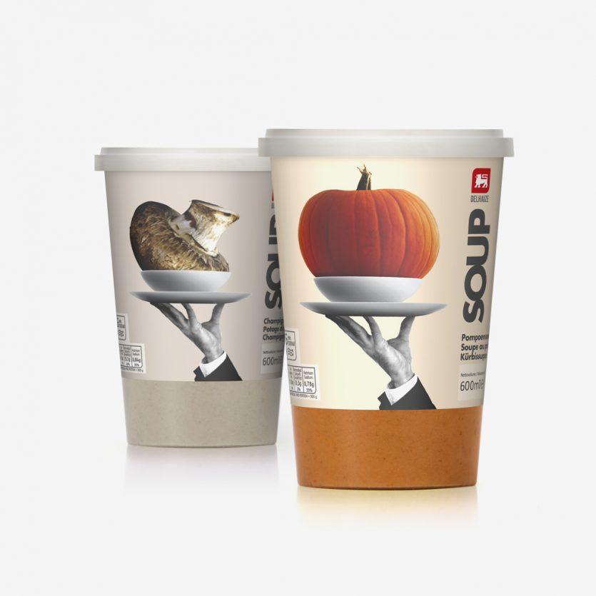
Delhaize Soups
The brief was to bring the main ingredient to life, preferably through the use of photo-realistic imagery, while adding a subtle touch of humour before serving. The romantic image of the waiter’s hands conveys positive associations of good service and quality. The restrained black-and-white photography helps to visually unify the entire range and is complemented by the use of simple, bold typography to balance the design.
The scale of the ingredients, shown in colour, is deliberately exaggerated in relation to the plate to emphasise the high natural vegetable content of the soups when compared with competing products. This play with proportion, combined with the waiter concept, adds a light-hearted sense of humour.
Bon appétit!
Sanico
The original logo of the business featured a seahorse. We redesigned the corporate identity while respecting the heritage of this motif.
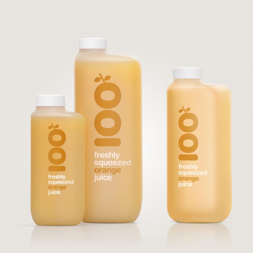
Zumex packaging
Zumex manufactures professional citrus and fruit juicing machines. A new line of bottles was developed for supermarkets and points of sale where customers can squeeze their own fruit and take away freshly pressed orange juice in a bottle of their choice, ranging from 25 cl to 1.5 L.
The bottles are made from translucent HDPE plastic. Ergonomics play a key role in the design, as customers are responsible for handling and refilling the bottles themselves. From a technical perspective, the product design was shaped by strict production and logistical constraints, as well as the need to keep costs to a minimum.
Within this framework, the challenge was to give the range of six bottles a strong sense of unity and personality. The result is a simple yet formal solution to a set of complex requirements. The graphic treatment shown is one of the personalisation options that Zumex offers its clients.
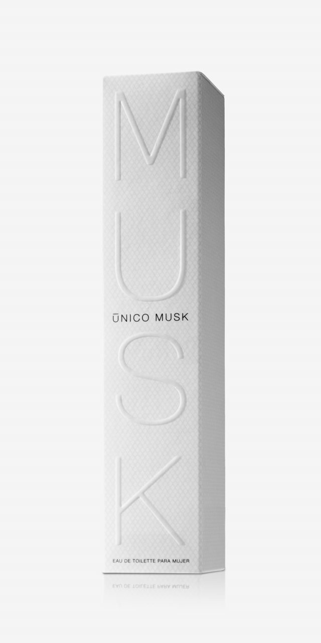
Único Musk
Musk is a highly valued substance in perfumery. It is very frequently used to give body and quality to many perfumes. Its delicate aroma evokes purity, clean skin, peacefulness, smoothness. The cylindrical bottle, the textile texture of the box, the graphic... and all, in the design of the Único Musk, want to evoke the pleasure of the habitual, of things simple, natural, authentic.
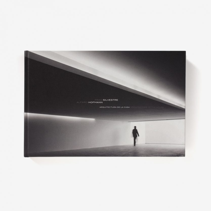
Arquitectura de la casa
The aim of this publication was to present the projects in a clear and didactic way, bearing in mind readers who are not familiar with reading or interpreting architectural drawings. The book is aimed particularly at this non-specialist audience—people who, while not trained in architecture, are nonetheless interested in good design and wish to understand the key features of each project and the reasoning behind the proposed solutions.
The publication is a direct response to this objective. From the format to the internal layout, every aspect has been designed to ensure clarity in the presentation of the projects, while remaining consistent with the authors’ working method and design philosophy.