

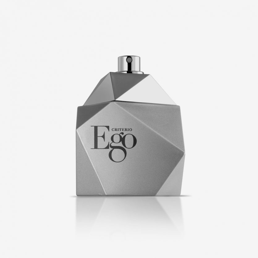
Ego
Ego aims to connect with a modern audience, concerned about their appearance, for a sophisticated elegance. The faceted glass pack has been painted in matte silver, such that the volume of the piece is solid and clearly defined. Ego uses a visual language which is direct and at the same time refined. The logo has been dealt with equal strength, starting with a Didot typeface in which the characteristics of the letter 'g' have been enlarged so that in context, three letters together form a single entity with more personality. It is distributed exclusively at the Mercadona chain of supermarkets.
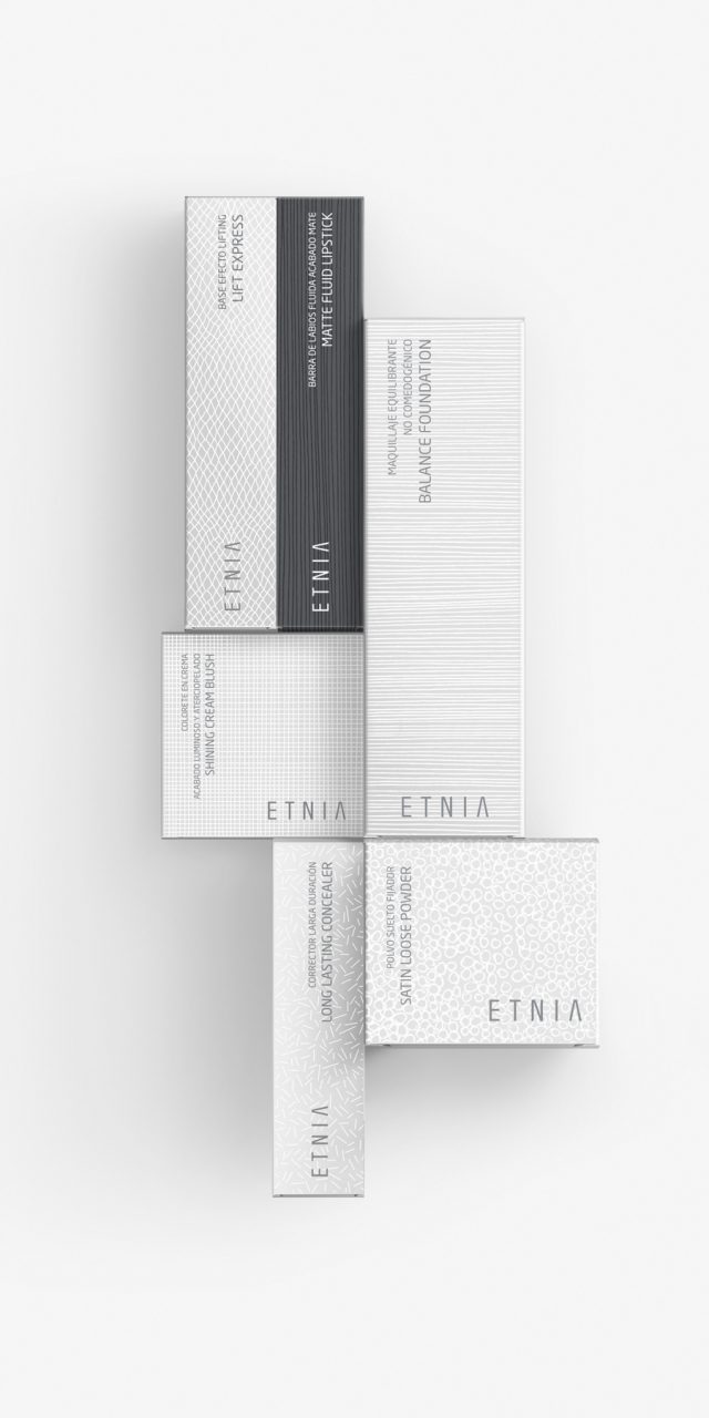
Etnia Make-up
ETNIA Cosmetics brand has a clear objective: To open a network of stores in Spain and to repeat the same strategy at international level. It is a global design project: brand, packaging, POS, web and communication at point of sale. It was decisive to begin defining the brand positioning and attributes, and then to translate them into a visual language in such a way that the brand personality is always present. ETNIA make-up and treatment lines include more than 200 references. It was a project which required the consolidation of a bespoke design with standard bottles. A complex task resembling a jigsaw puzzle. Pieces from different suppliers have been selected, and materials, finishes and processes have been chosen, and applied, in such a way that the end result, composed of pieces from multiple suppliers with different resources, is feasible whilst keeping everything coherent and transmitting a consistent ETNIA personality. Make-up, which is a key product in ETNIA shops, is full of colour, lines and textures. The visual identity takes these characteristics as a starting point for its packaging design, which highlights the most representative attributes of each category, such as elegance and beauty. The result is a design which differentiates from the usual characteristics, visual cues and trends of other brands, resisting silver, gold, and design elements associated with the make-up world. Instead, varying textures give the design a fresh and dynamic touch, and at the same time they serve as a flexible solution for an innovative brand with diverse product lines, which is in constant flux. (fragrances, body care, facial cosmetics…).
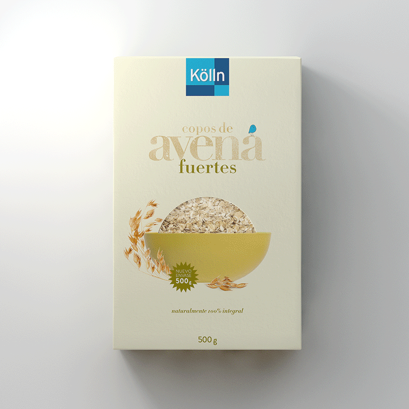
Kölln Oats
Kölln is a leading German manufacturer of whole oat products. Although its standard products were already available in Spain, the packaging was redesigned to reposition and relaunch the brand specifically for the Spanish market. The global advertising agency FCB led the process and developed the brief.
The new packaging needed to feel more approachable and optimistic in tone, while clearly differentiating itself from mainstream competitors by emphasising its premium positioning. Printed on recycled card, we adopted a contemporary colour palette, carefully combined to communicate the different muesli flavours directly and intuitively. This was achieved through typographic treatment and a two-dimensional illustration of a bowl, forming a semi-circle that acts as the focal point of the design. To complete the pack, we incorporated a die-cut window revealing the bowl filled with Kölln’s finest natural ingredients.
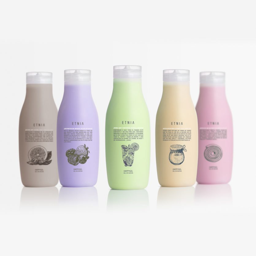
Etnia Happy Gels
Fruit, chewing gum, biscuits, and mojitos—objects that usually belong to everyday consumption or are quickly discarded—have found a new lease of life in Etnia’s fun and vibrant Happy range. They have been reinterpreted as body lotions (Happybodys) and shower gels (Happygels), resulting in appealing and distinctive fragrances.
Happygels form part of the youthful and energetic product lines offered by Etnia, a new make-up and cosmetics brand. The design and communication are clearly focused on a young audience, with humour playing a central role throughout the project—from the bottle design to the illustrations, where old engraving techniques meet the visual language of comic strips, and extending to the informal, playful, and suggestive tone of the copy.

Ona
We created the visual identity for the women’s clothing store Ona (meaning “woman” in Japanese), which showcases Spanish fashion designers. The characters, conceived in the manner of a Japanese ideogram, come together to form a female figure.
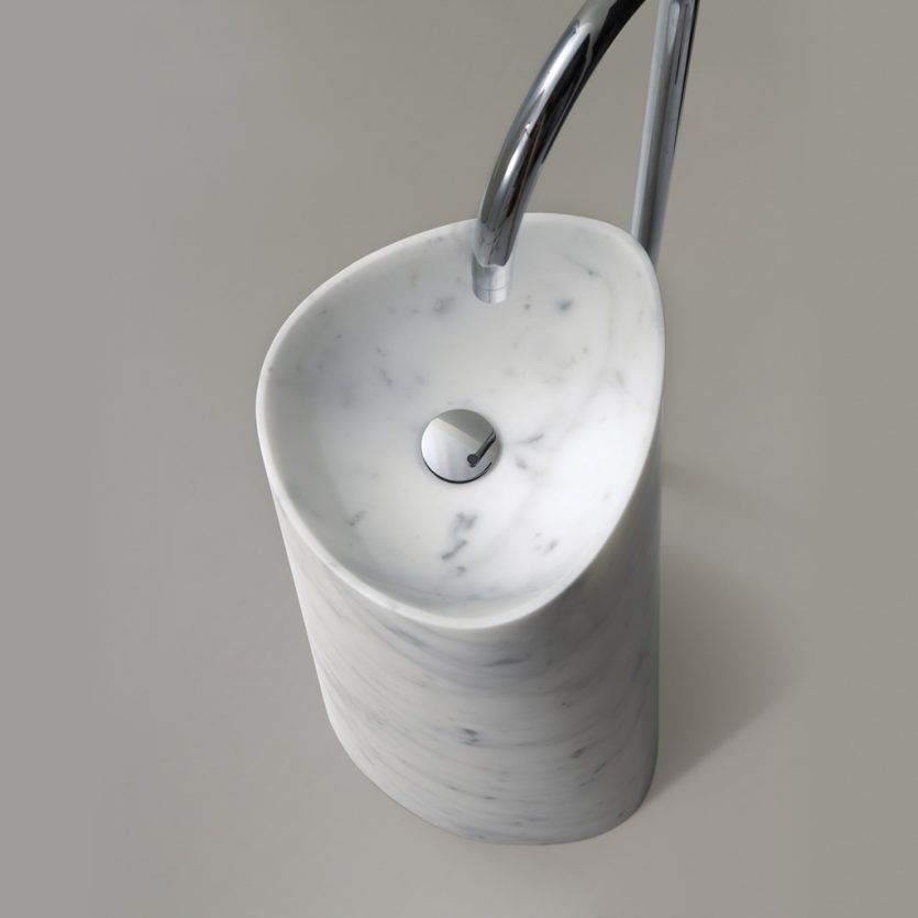
Faro
The client commissioned the design of a freestanding washbasin aimed primarily at public buildings—such as hotels and restaurants—while also remaining suitable for domestic settings. They were looking for a distinctive piece, a washbasin that would not go unnoticed.
In Faro, there is no inherent symmetry or defined front—at least until the tap is installed—allowing the washbasin itself to become a decisive visual reference, the element around which the entire bathroom revolves. It is made from natural stone, reinforcing the sculptural character of the design.