

9.60
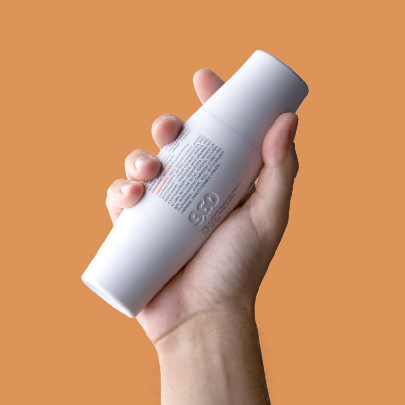
This is a mass-market range of men’s cosmetic products distributed exclusively through 1,500 stores of the Spanish supermarket chain Mercadona. The line is positioned around concepts such as fitness, sport, and physical exercise, and the packaging design reinforces these ideas.
The name alludes to the notion of a sporting record, while the packaging references the morphology of muscle. All 100 ml and 200 ml containers were designed with an ergonomic shape and manufactured in flexible plastic, making them highly resistant and easy to carry in a sports bag.
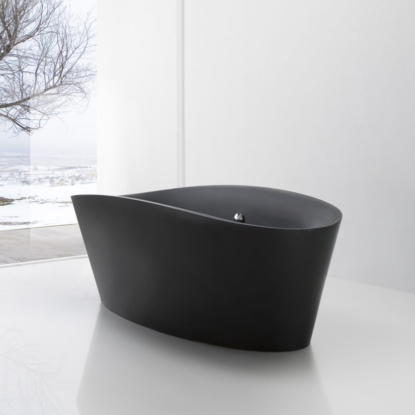
Tina
Tina responds to the contemporary concept of the bathroom, which has evolved from a purely functional space into one where we spend increasing amounts of time and where comfort, experience, and aesthetics play a central role. For this reason, Tina features a sensually rounded, comfortable, and evocative form, standing in deliberate contrast to the squared, straight-edged shapes currently prevalent.
It is made from mineral resin (Stonefeel®).
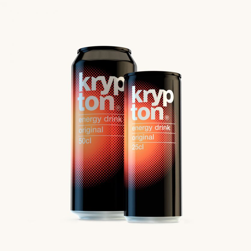
Krypton
All beverage categories have their own distinct visual codes, which help consumers quickly recognise the type of drink they are looking for—in other words, to communicate effectively. In the case of energy drinks, references to the concept of “energy” are overt and almost unavoidable. With just a few elements, from naming to graphic language, everything is directed towards conveying a powerful, energetic image aimed at connecting with a young audience.
A red circle expands outwards from the centre, like an explosion against a black background, transmitting strength and dynamism while simultaneously creating a strong focal point on the shelf. The name krypton, with its obvious associations, is further reinforced through distinctive typographic features that give it a unique and memorable character.
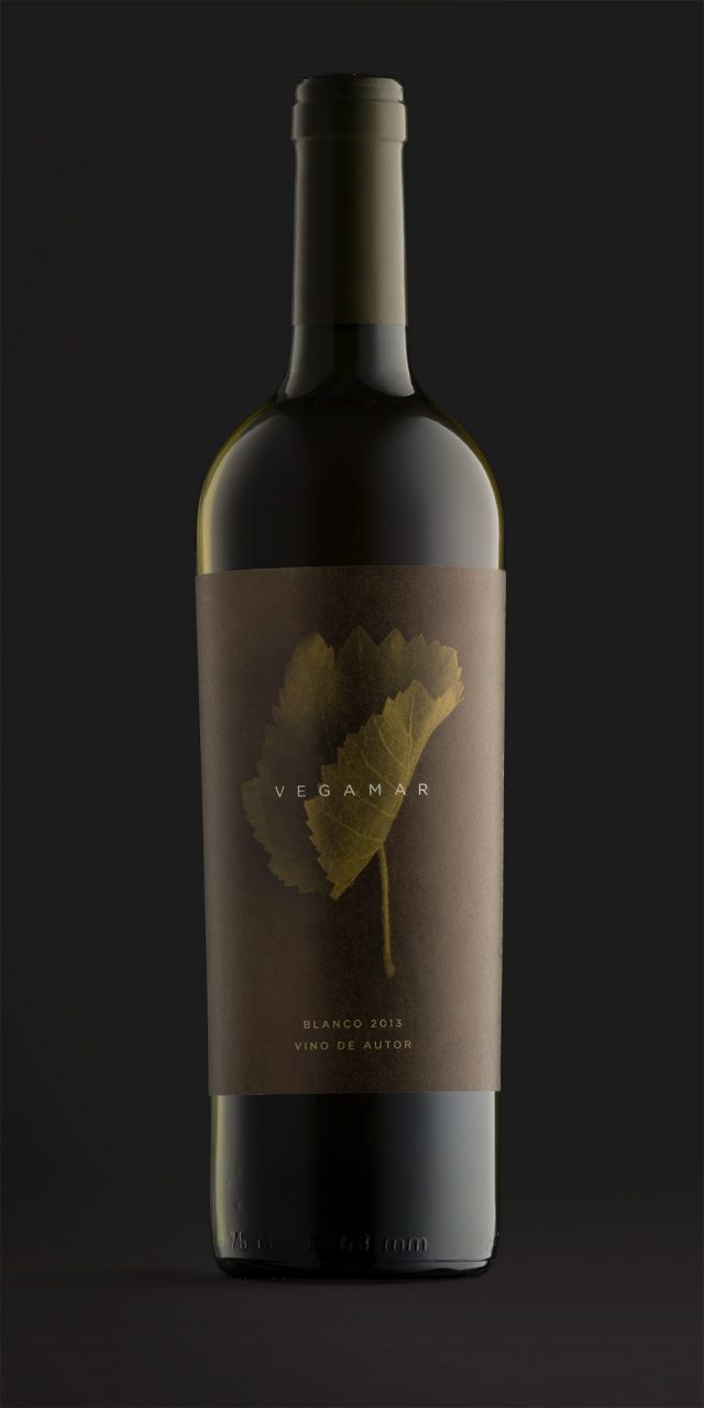
Vegamar Wine
Wine is grapevine and time. On the one hand, grapes grow and mature slowly; on the other, months of winemaking through a delicate craft give rise to a process that is inherently unpredictable. This interplay between the vine leaf and the passage of time forms the conceptual basis of the Vegamar Selección identity, a dedicated space designed for tasting and purchasing select wines, cava, olive oil, and other Vegamar products.
Vine leaves were collected and photographed as they began to dry and curl in on themselves, each evolving in a unique way. This natural transformation mirrors the wine ageing process, which also contains an element of chance and an unpredictable beauty. The store’s visual identity is built around these images, treated in monochrome, and has been applied across gift packaging as well as wine, cava, and olive oil labels.
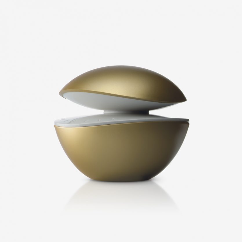
Codizia Woman
Codizia is a fragrance developed for women who look for a quality and premium product, but at a much lower price than the top range perfumes. its bottle tries to transmit these attributes: elegance, personality, sophistication. With its rounded shapes, the golden finished glass, and the two curved white surfaces, which facing each other, produce a light and reflection effect. The package has a graphic design that refers to the shapes and colours of the bottle. It is distributed exclusively at Mercadona shops.
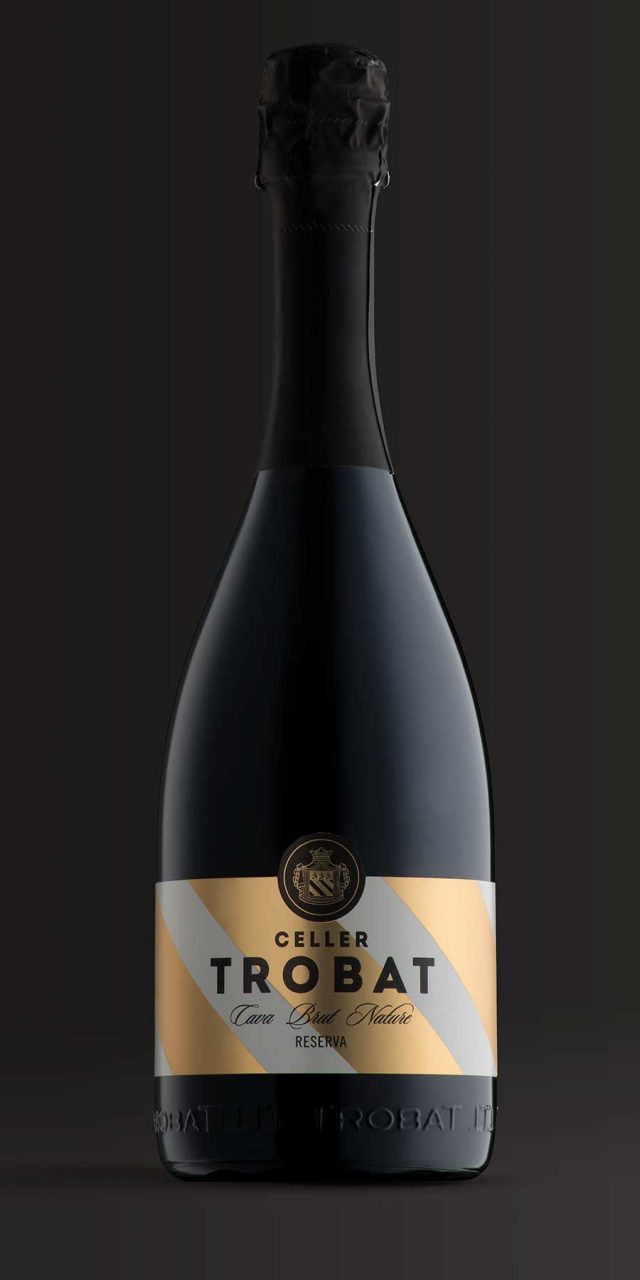
Celler Trobat
Celler Trobat is a winery located in Empordà (Catalonia) with a history spanning more than 200 years. It produces wines and cava with designation of origin status. We were commissioned to redesign the labels for its cava range, whose previous packaging placed strong emphasis on the winery’s coat of arms.
As this emblem was already well established in the market and a key identifying feature of the brand, it needed to be preserved and became the foundation of the new design. We gave prominence to the stripes of the shield, reproducing them at a large scale: in gold and white for the Reserva, and in metallic pink for the Rosé. These stripes form a powerful and elegant background against which both the typography and the coat of arms stand out. The emblem itself was slightly simplified to ensure harmony with the more contemporary visual language of the new design.