

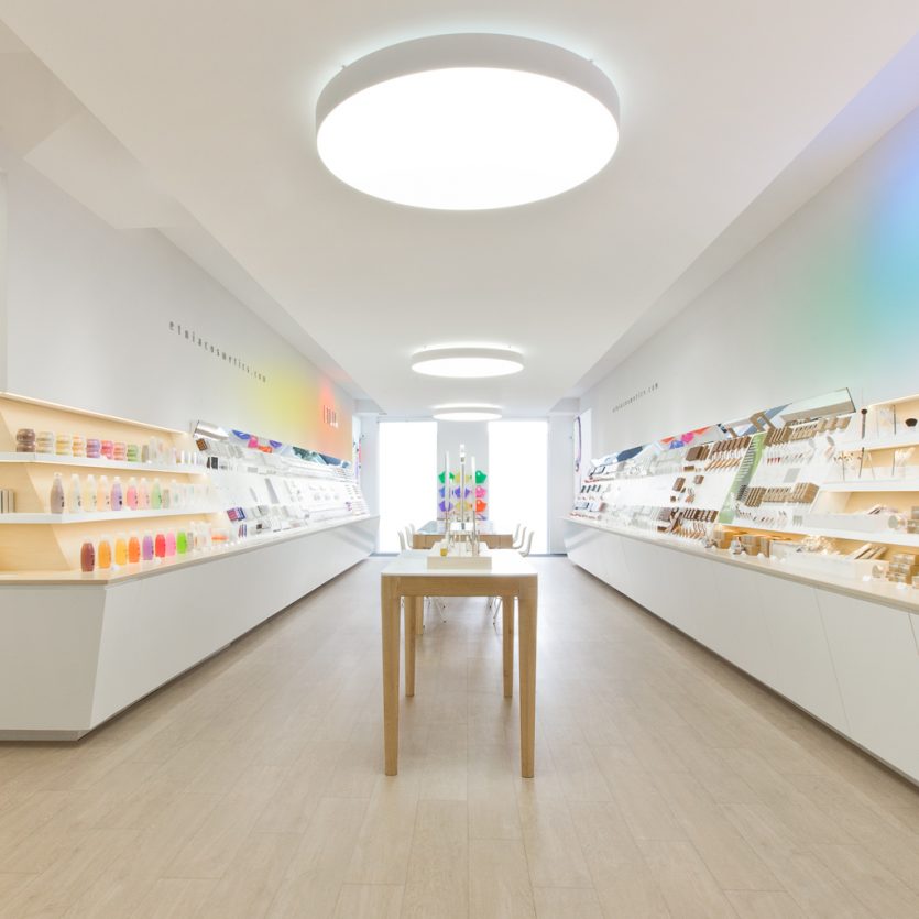
Etnia Shops
ETNIA Cosmetics brand has a clear objective: To open a network of stores in Spain and to repeat the same strategy at international level. The shops spacial design had to take into account efficiency, functionality and image. This is why modularity, product presentation and general appeal of the product at the point of sale have been central to the project. White combined with clear woods tones and quality lighting are some of the features that set ETNIA apart from other shops in the sector. The central table and the circular light fixtures are key elements of the shop personality and make a clear statement: ETNIA shops are a meeting and experiential points for people looking for innovation and quality in make-up, cosmetics and fragrances. In each ETNIA store, people can find a special corner to experience a new consumer experience. Concept and design by: Lavernia&Cienfuegos. Development and production: Tejedor Asociados/Prodiseño
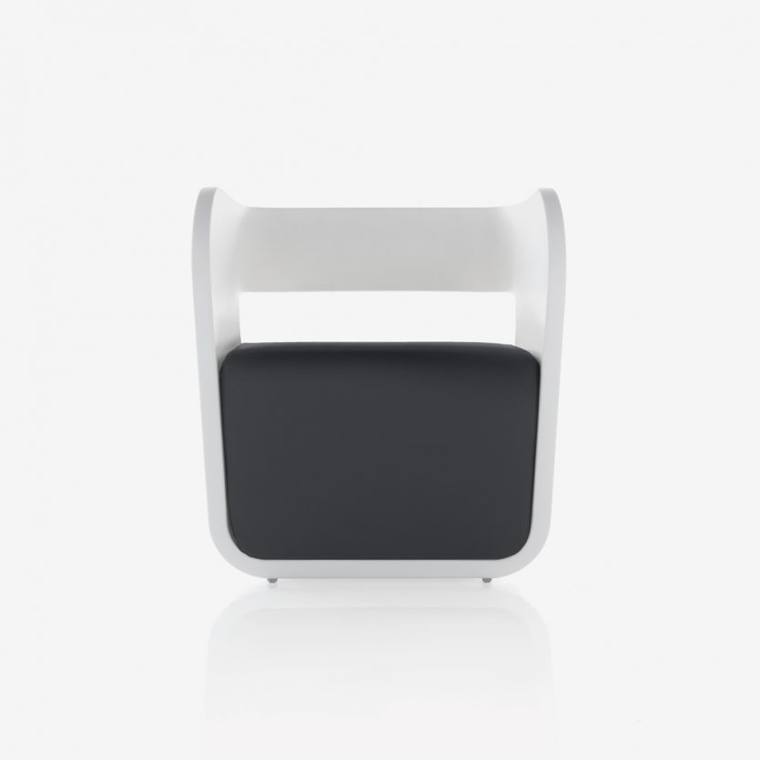
Alma
Alma emerged from an exploration of different typologies, seeking a new composition and a distinctive relationship between the elements that make up an armchair. The design is structured around two clearly differentiated volumes, allowing for the combination of colours and materials and enabling its use in different contexts.
Alma In is the fully upholstered version, conceived for interior spaces, while Alma Out is designed for outdoor use. The latter is made of plastic (polyethylene) and can be combined with a fabric seat—an innovative feature in outdoor furniture design.
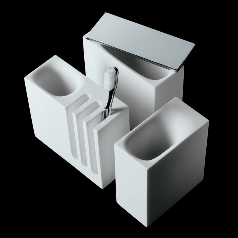
City
Given that the aim was to develop a range of bathroom accessories suitable for intensive use in large-scale organisations—such as hotels, offices, and public spaces—we approached the project with a strong focus on durability. The units needed to convey robustness, which led us to design them using visually powerful forms based on rectangular prisms.
By contrast, the openings that articulate these public spaces are smooth and rounded, softening the overall appearance. The pieces are produced in mineral resin (Stonefeel®) in combination with brass.
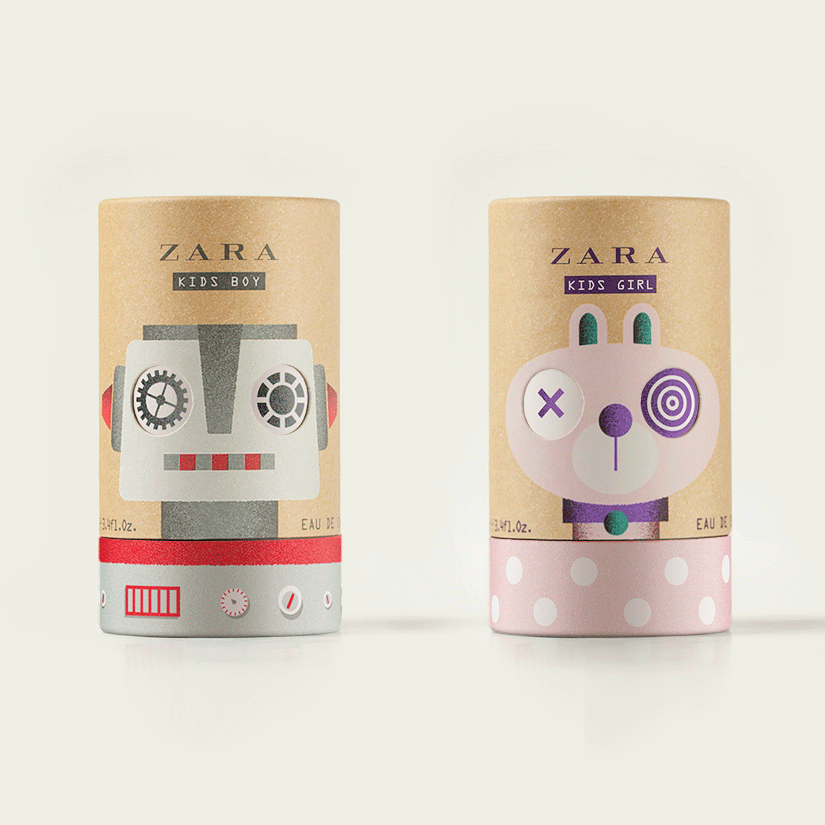
Zara Kids
Zara Kids is a fragrance designed for children aged between 3 and 14. We were asked to create two illustrated characters that were fun and appealing, spoke directly to a child’s visual language, and clearly differentiated between boys and girls. Our response was to design a bunny and a robot, each with a carefully selected colour palette to fulfil these requirements.
Beyond the illustrations themselves, we were particularly interested in giving the characters a playful twist—quite literally—rather than turning the packaging into a merely attractive protective casing to be discarded once opened. Using cardboard tubes, we developed a rotating lid that allows the eyes of each character to change with every turn. A further playful detail lies in the fact that the position of the lids is not fixed to the base of the tube, meaning that each unit aligns differently on the shelf, adding variety and surprise at the point of sale.
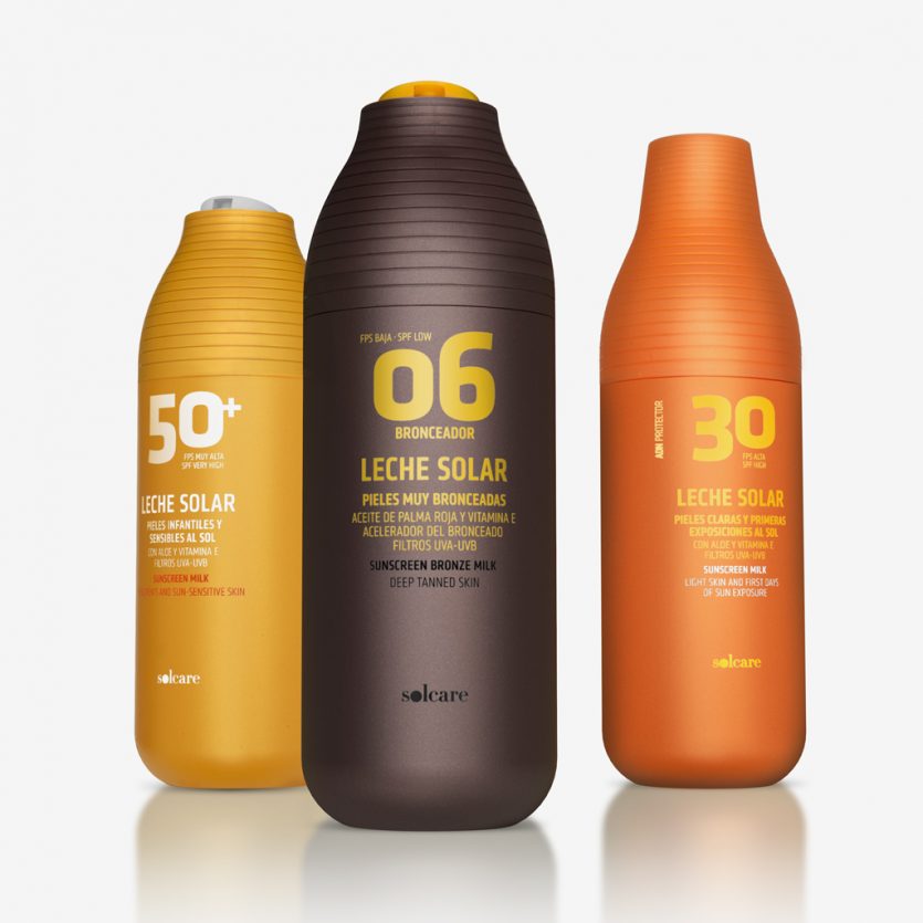
Solcare 2012
Packaging design for a sun-care range sold in Mercadona supermarkets. The project was defined by a highly demanding brief: to optimise processes and costs without sacrificing perceived quality, attractiveness, or strong shelf presence.
For a total of 36 product references, we designed just two bottle formats. These containers accommodate different caps and dispensing systems—pumps, sprays, disc-top closures—while effectively responding to the project’s dual objectives. On the one hand, they solve logistical and production challenges; on the other, they allow a wide and clearly differentiated product range to be created from only two packaging designs, each with a strong and recognisable personality.
Colour plays a key role in distinguishing the different sub-ranges—sun protection, tanning, aftersun—while the graphic design ensures rapid and intuitive product identification. This is achieved through the prominent and powerful use of a numeral indicating the protection factor, a decisive element in the purchasing process, which simultaneously reinforces the visual identity of the range.

Zara Play
Zara Baby Boy and Zara Baby Girl are fragrances designed for children aged between 1 and 3. We were asked to create simple, appealing packaging that spoke clearly in a child’s visual language while also fitting within a new vintage aesthetic.
To achieve this, we developed a concept inspired by the classic building blocks game—a familiar object that introduces children to letters and numbers through play, while also carrying a strong nostalgic and vintage connotation. The faces of the cube-shaped packaging are designed so that, when aligned, they spell out PLAY using uncomplicated yet lively typography, suitable for any Zara store worldwide.
Another key requirement of the brief was to provide a practical solution for point-of-sale display—one that would not require excessive involvement from store staff. By its very nature, the building blocks concept offers an ideal response: the cubes can be casually arranged or left deliberately disordered, creating a playful and spontaneous presentation at the point of sale.