

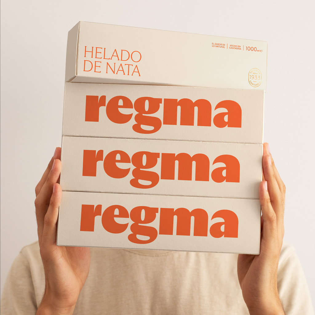
Regma
Regma is an ice cream and pastry chain with more than 200 points of sale and over 90 years of history, holding a leading position in Cantabria and enjoying strong recognition in other regions of northern Spain. Its core values are quality, honesty, 100% natural products, and traditional recipes. The company is currently seeking to expand its presence in supermarkets and large retail stores, beyond its own outlets. This growth objective has highlighted the need to update and strengthen the brand’s image in order to better connect with a younger audience and adapt its packaging to the demands of retail shelves.
Our work focused on modernising the logo, giving it greater strength and personality. The new identity is more vibrant and memorable, and the redesigned logo can be applied in large formats as the key visual element of the packaging. In addition, communication materials were redesigned, with particular attention paid to point-of-sale materials (POS). The product packaging was also updated to achieve an iconic, easily recognisable design that meets the requirements of different sales channels: own stores, supermarkets, large retail outlets, and online sales.
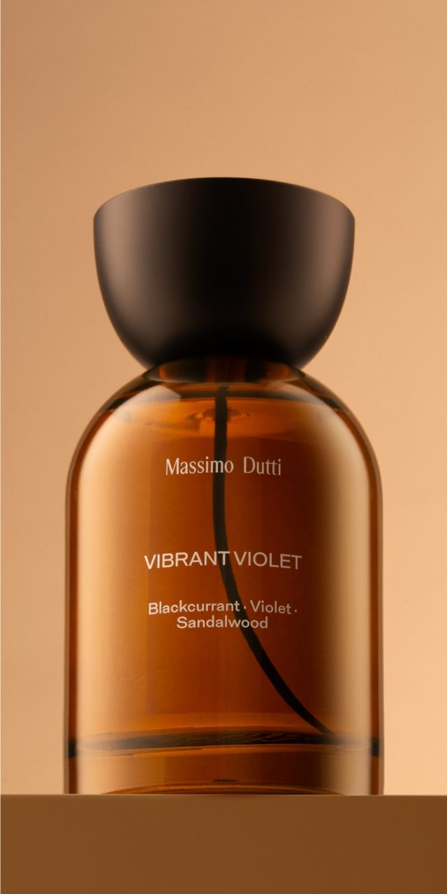
Massimo Dutti Blooming
With Blooming, the brand set out to create a new fragrance family with its own distinctive codes, opening the door to a slightly more daring olfactory world and elevating the image of perfumery—particularly at the point of sale.
This family of women’s fragrances is based on floral notes, which inspired the name of the collection. The client’s brief called for a warm visual identity, with amber as the main colour and an elegant, timeless aesthetic. The semi-sphere—or semi-circle—used as a floral icon is the geometric form that structures the entire packaging.
We chose a bottle with rounded shoulders and designed a bespoke stopper specifically for it. The distinctive feature of the container’s silhouette lies in the inverted curves of both the bottle’s shoulders and the stopper. A black tube adds a unique touch while echoing the colour of the stopper. The box is encased in a sleeve that features, on its lower section, a die-cut reproducing the characteristic semicircular shape of the design.
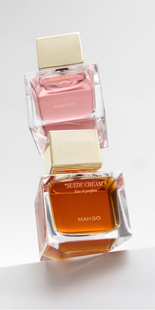
Les Icônes
Mango entrusted us with the design of its new women’s fragrance collection: Les Icônes.
This line is created for the contemporary woman, aged between 35 and 50, who seeks a fragrance that is modern, distinctive, and accessible—able to express personality while remaining approachable.
The bottle has a compact, balanced shape. The thick glass base conveys solidity and quality, while its simple, recognisable silhouette makes it easy to identify and pleasant to hold. Each fragrance is distinguished by a colour that reflects its character, with transparent glass and a golden cap adding a touch of elegance.
The packaging, in matte white with golden details, conveys sobriety and harmony with the bottle, enhancing the overall perception and turning the product into a desirable object—also perfect for gifting.
Photography: Sonia Sabnani
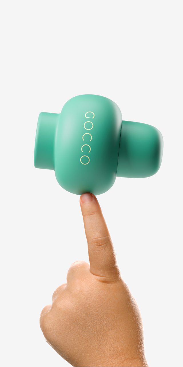
Gocco
Gocco, the Spanish brand specialising in children’s and youth fashion, ventured into a new territory: fragrances for boys and girls aged 2 to 6.
Our proposal was to create a design that encourages play while maintaining a contemporary and refined aesthetic—one that sparks curiosity at first sight.
The SuperOrange and SuperGreen bottles break away from the clichés of children’s perfumes, drawing inspiration from the tactile, the volumetric, and the sensory. With their smooth, rounded shapes, they establish a natural connection with young children, avoiding the usual stereotypes: the bottle does not depict anything specific—it is neither an animal nor a television character. Instead, it is an object open to each child’s imagination. Today it may be a submarine; tomorrow, a spinning top—or even a gentleman with a hat.
Colour reinforces this identity: the vibrant orange of SuperOrange and the deep green of SuperGreen convey energy and character, while the packaging graphics complete the ensemble with dynamism and coherence.
The result is a contemporary, stimulating, and functional design that embodies the essence of the brand while inviting children to imagine stories and play without limits.
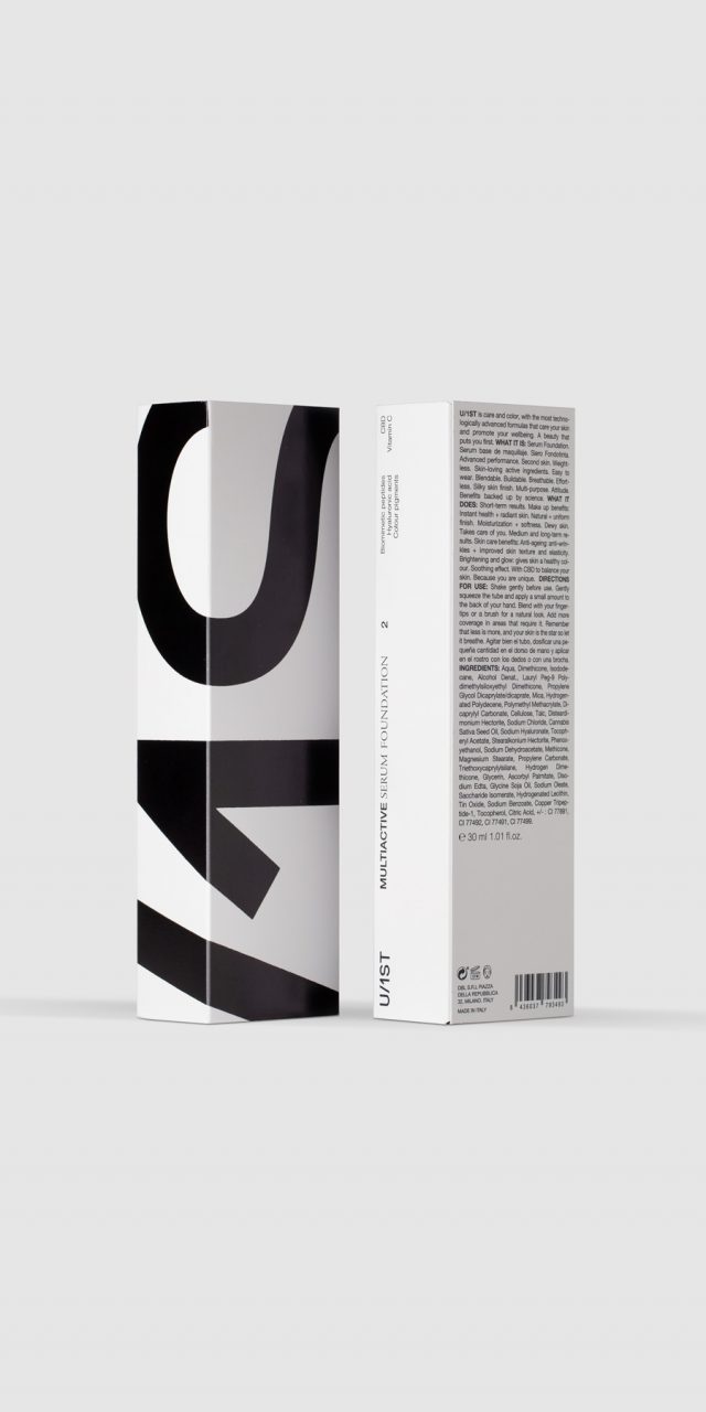
U/1ST
U/1ST was created with the purpose of developing a makeup line whose properties and ingredients care for the skin, going beyond a purely aesthetic approach.
The products are designed for active, confident, and straightforward individuals who seek practical and realistic solutions. The logo, overflowing beyond the edges of the boxes, reflects this personality: powerful, even challenging. This attitude is evident not only in the packaging design but also in the brand’s presence across the web, social media, and all visual communication.
The logo is set in a sans-serif typeface that complements the advanced technology behind the products. It is presented in black on white, as the strong contrast enhances its visual impact and sets the brand apart from more conventional solutions, which often rely heavily on colour, particularly in competitors’ packaging.
A bespoke typographic system was also developed, combining a sans-serif typeface—suggestive of technology and modernity—with a serif typeface that feels closer to the world of beauty. This combination establishes hierarchy and guides the reading of the messages.
In the box design, two sides feature an oversized logo, while the other two carry the product descriptor and additional information. This structure allows the brand to choose which side faces the shelf: the most eye-catching and emotional, the more informative, or a balance of both.
Photography: L&C, Ernesto Sampons, Daniel Molina, Estudio Catorze
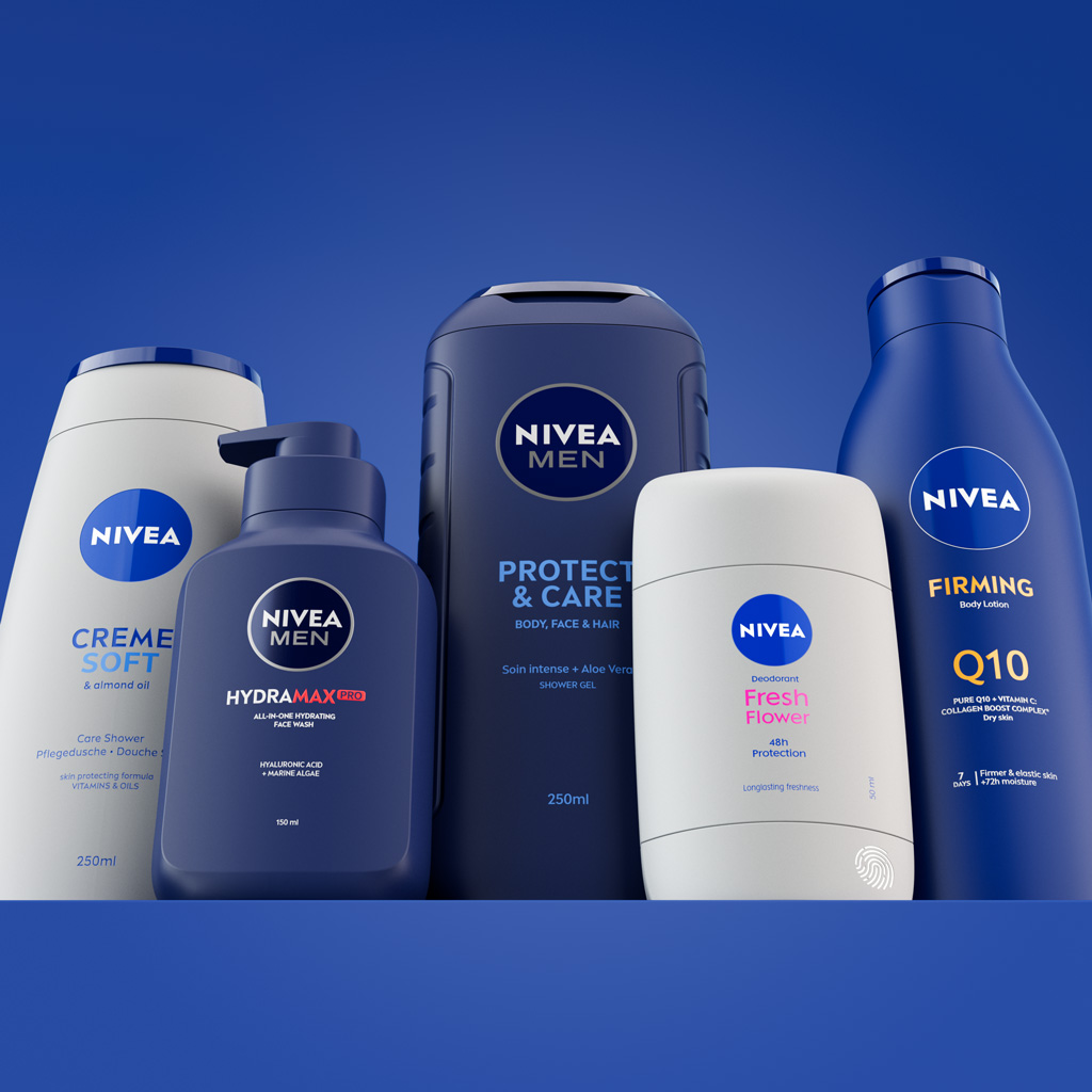
Nivea
NIVEA—a brand with over 100 years of history and a deeply rooted global positioning—reached out to Lavernia & Cienfuegos in 2018 to develop an ambitious design project. By then, we had already built experience designing packaging for international brands such as Unilever (Dove, Sunsilk, Rexona), Puig, and Zara. But this time, the challenge—and the level of demand—was even higher.
The first objective was to define a design language that could reflect and convey the values and attributes that give the brand its personality and distinctiveness. A language that would bring coherence across all its packs. A visual system that would allow a NIVEA product to be recognized even without seeing the logo. A guideline flexible enough to adapt to different audiences and needs.
This led us to a deep exercise of analysis and definition around three-dimensional form and its expressive capacity: its potential to evoke, communicate, and speak about the product and the brand it represents.
This language is built from the elements that define form: the geometry of volumes; the type of surfaces (flat, curved, etc.); the connections between parts (cap, neck, shoulders, body, etc.); edge treatment (straight, rounded, etc.); functional design (ergonomics); finishes; textures; and even other cues such as sound, touch, weight, or consistency (rigid or soft).
This first phase of the project took nearly two years and was developed in close collaboration with NIVEA’s marketing and design team.
Once the language was defined, NIVEA trusted us again to develop specific packs. In this stage, it was key to align with one of the brand’s major goals for 2025: reducing plastic weight and increasing the proportion of recycled material.
With this premise—and considering that some existing packs could fit within the previously defined language—two working scenarios emerged:
1 Designing new packs, such as the unisex deodorant stick, the men’s facial cleansing pump bottle, and the new shower gel bottle for NIVEA Men.
2 Redesigning existing packs to optimize aspects such as cost, functionality, ergonomics, or sustainability. In this area we developed the family-size shower gel bottle and the iconic Body Milk bottle. For Body Milk, we designed the full range of sizes (from 75 ml to 750 ml), improving the following areas: a new cap with reduced plastic weight that allows the bottle to be stored upside down to help product dispensing; a new pump also with less plastic weight than the previous one; and a bottle with higher shoulders, giving it a slightly more unisex look while maximizing the labelable area.
This second phase extended for nearly three years of intense work, involving key departments such as category leads (body, face, shower, etc.) and the internal packaging team.
A collaboration that has left a deep imprint of knowledge and learning at L&C.