

Nivea Cleanser
In 2018, Nivea entrusted Lavernia & Cienfuegos with an ambitious 3D design project with a dual objective:
1. Defining a coherent packaging design language
When Nivea approached us, the brand had identified the need to unify its packaging under a visual language that would faithfully reflect its DNA. We studied the company’s history, values, and positioning to develop a coherent formal language that would make its products recognisable even without logos or applied graphics. This involved an in-depth analysis of three-dimensional form, its expressive potential, and its ability to convey both product and brand identity.
2. Establishing visual codes and resources for different audiences
We developed specific visual codes and design tools to segment packaging for different audiences—unisex, family, male, and female—while maintaining consistency with the newly defined language.
With this foundation in place, we went on to design a wide range of packaging formats, including deodorants (stick, spray and roll-on), shower gel bottles, men’s products and the redesign of the brand’s iconic body lotion bottle.
In all these projects, the brand’s commitment to sustainability was a constant priority, reducing the amount of plastic used compared to previous packaging.
The project spanned nearly six years and involved close collaboration with Nivea’s marketing team and other key departments, including category managers (body, face, shower, etc.) and the internal packaging team.
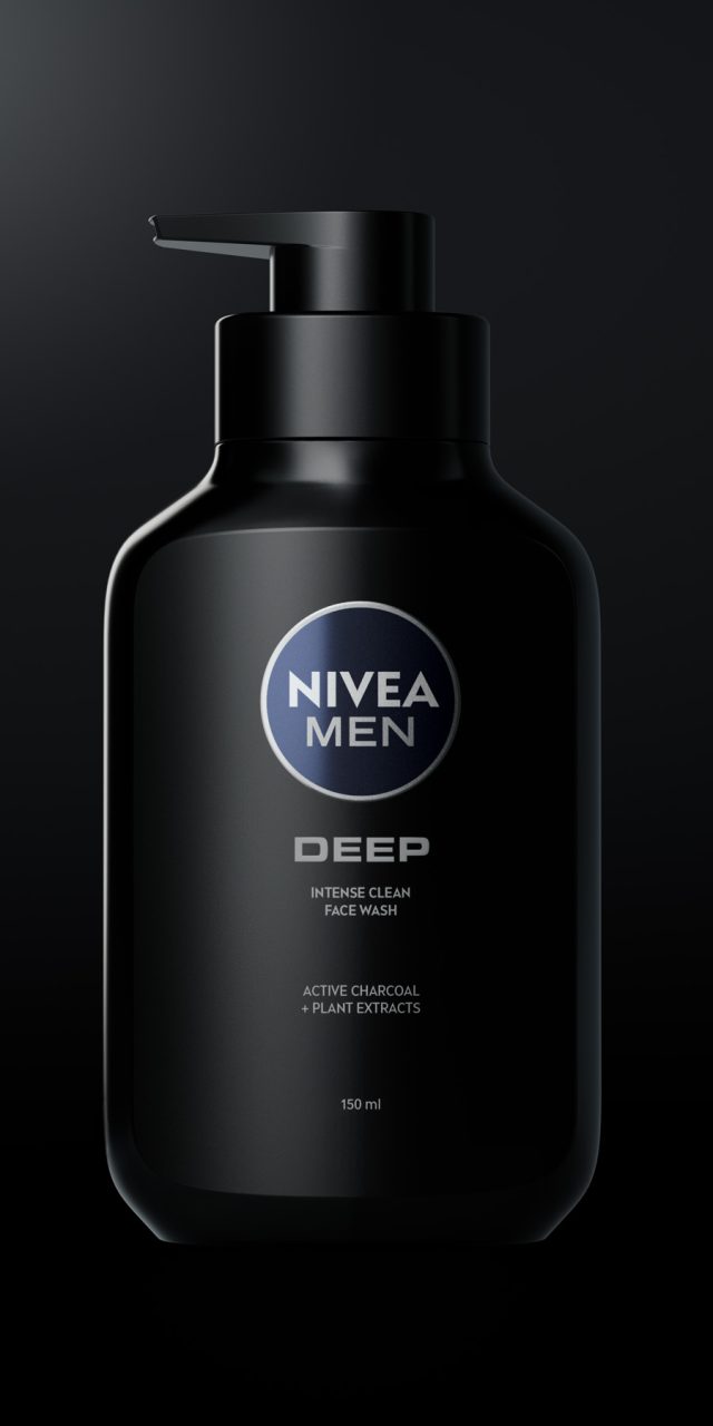
One example of this work is the Oil Control line for the Chinese market. The objective of this update was to deliver a more modern, premium masculine aesthetic while conveying German quality and high-tech scientific expertise through a new structural design. To achieve this, we designed a bottle and a custom dispenser that combine square, robust forms—expressing masculinity—with softer, rounded shapes that communicate care and protection.municate care and protection.
Edit (036)
- 1. Concept
Two design approaches converge in Edit 036: on the one hand, the concept of customisation—the possibility for the user to participate directly in the final configuration of the object; and on the other, the incorporation of the emotional dimension as a fundamental part of the relationship between object and user.
Postmodern design criticised the International Style for its coldness and its uncompromising focus on functionality and production, on the strict values of use and exchange. In response, it brought to the forefront the communicative value of objects—what Jean Baudrillard described as sign value: the ability of an object to represent us, to speak about us, and to convey our lifestyle. Not only outwardly, towards others, but also inwardly, to ourselves—establishing an emotional bond between the object (in this case, the packaging) and the user that transcends pure functionality.
Edit 036 combines industrial techniques with artisanal processes. This approach is increasingly relevant today, as it has a direct impact on product sustainability. At the same time, it is becoming ever more prevalent in the world of luxury goods, where the excellence and exclusivity of artisanal production—rooted in tradition, uniqueness, and the warmth of handmade objects—are especially valued.
- 2. Approach
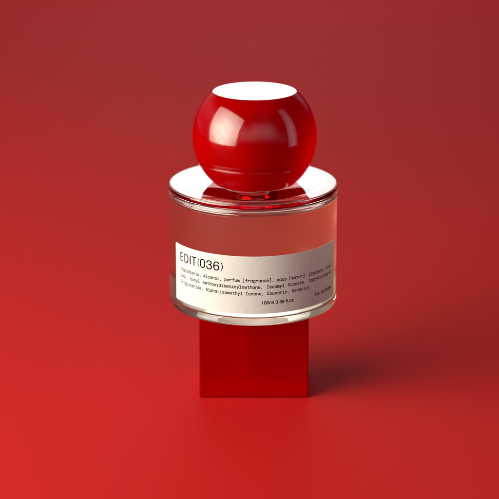
Edit 036 is built around two modular elements, both designed under rigorous sustainability criteria: a specially designed central glass piece, available in five different finishes; and a second element that functions both as the cap and as the base of the bottle. This latter component is offered in six different geometries—hence the name Edit 036, as it allows for 36 possible combinations of cap and base.
Each of these components is available in five materials, each presented in three different finishes, enabling the user to create their own bottle by selecting the desired glass model, cap, and base. In total, this system offers 40,500 possible combinations.
The bottle features a label with perfume information and the logo, and is presented in a rigid, lined box that closes with a customisable label. The customisation process takes place through a dedicated website, where users can view and select the different characteristics of each component, actively participating in the creation of their final product.
Nivea Shower
In 2018, Nivea entrusted Lavernia & Cienfuegos with an ambitious 3D design project with a dual objective:
1. Defining a coherent packaging design language
When Nivea approached us, the brand had identified the need to unify its packaging under a visual language that would faithfully reflect its DNA. We studied the company’s history, values, and positioning to develop a coherent formal language that would make its products recognisable even without logos or applied graphics. This involved an in-depth analysis of three-dimensional form, its expressive potential, and its ability to convey both product and brand identity.
2. Establishing visual codes and resources for different audiences
We developed specific visual codes and design tools to segment packaging for different audiences—unisex, family, male, and female—while maintaining consistency with the newly defined language.
With this foundation in place, we went on to design a wide range of packaging formats, including deodorants (stick, spray and roll-on), shower gel bottles, men’s products and the redesign of the brand’s iconic body lotion bottle.
In all these projects, the brand’s commitment to sustainability was a constant priority, reducing the amount of plastic used compared to previous packaging.
The project spanned nearly six years and involved close collaboration with Nivea’s marketing team and other key departments, including category managers (body, face, shower, etc.) and the internal packaging team.
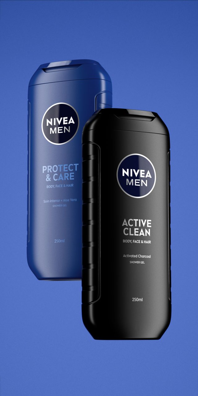
An early outcome of this collaboration was the new bottle for the Nivea Men shower gel range. The brief called for a design that would convey masculinity and efficiency while preserving the essence of the previous bottle. We opted for solid, straight, and bold shapes inspired by classic codes of masculinity, combined with a more modern, sporty feel. (The 250 ml format is widely used in gyms thanks to its easy-to-carry format.)
Special attention was given to the bottle’s ergonomics, incorporating side grips to improve handling. Details were also carefully considered: the contrast of textures on the cap—a combination of glossy and subtly rough surfaces—adds tactility and character to the overall design.
In this case, the cap was redesigned to significantly reduce the amount of plastic used compared to the previous model, without compromising the user experience.
Massimo Dutti 1985
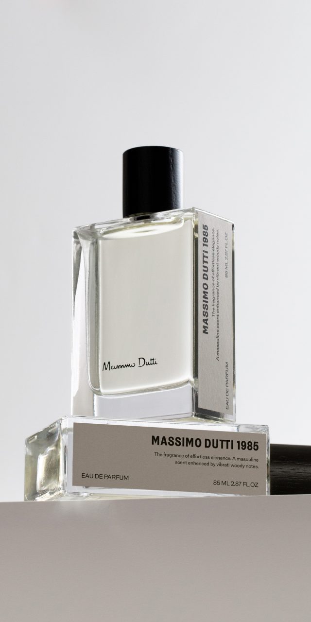
Massimo Dutti has launched a new men’s fragrance, 1985, named after the year the company was founded. The aim was to create a contemporary, youthful, and fresh scent while preserving the sense of elegance that defines the brand.
For the secondary packaging, we adopted the concept of a book, so that its in-store display resembles a library. For this reason, the information appears on one of the sides, which functions as a spine. To enhance the perception of quality, the box is wrapped in a textile-like paper and features black stamping for the brand name. In addition, a fabric ribbon facilitates the extraction of the bottle, which also carries a label on one side.
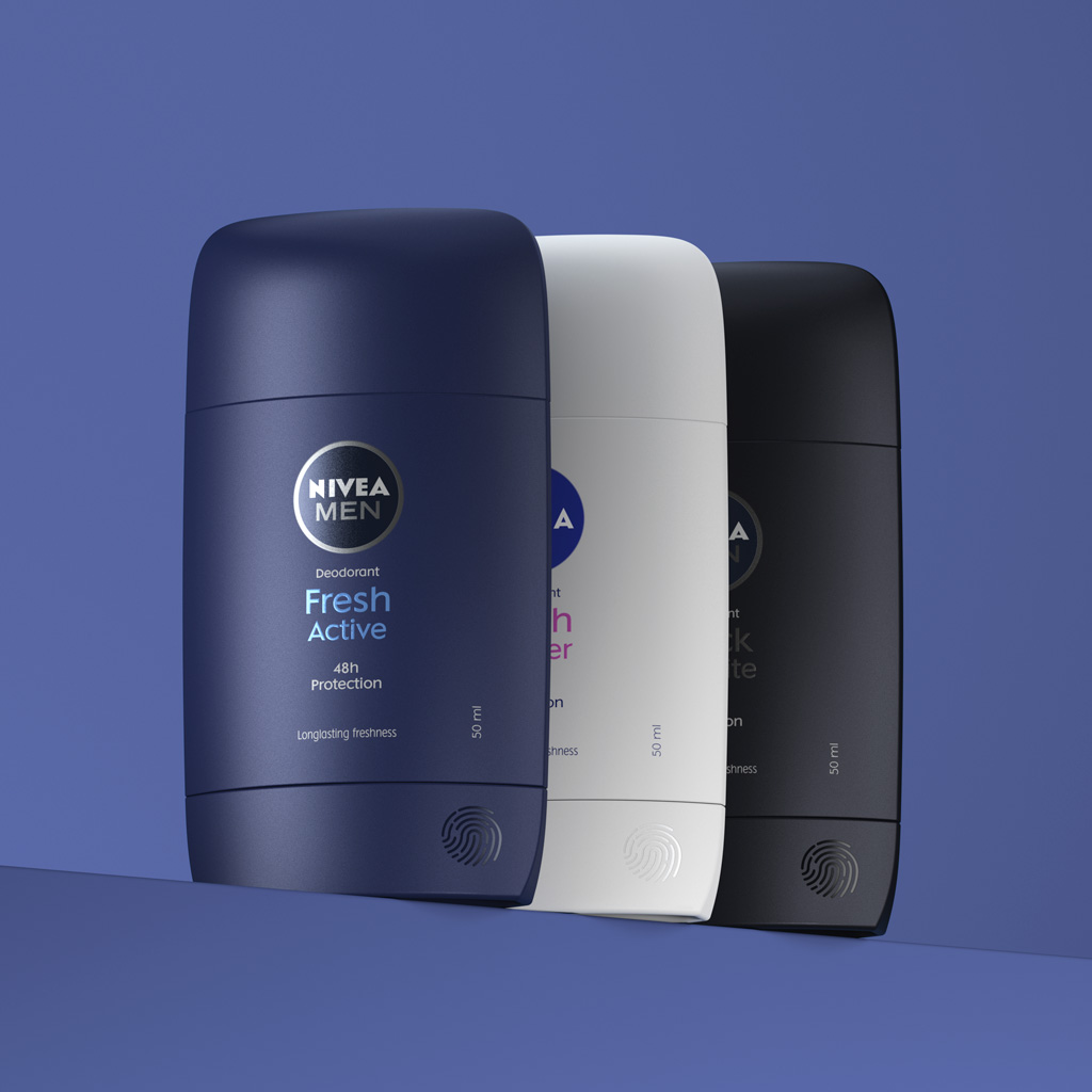
Nivea Deo Stick
In 2018, Nivea entrusted Lavernia & Cienfuegos with an ambitious 3D design project with a dual objective:
1. Defining a coherent packaging design language
When Nivea approached us, the brand had identified the need to unify its packaging under a visual language that would faithfully reflect its DNA. We studied the company’s history, values, and positioning to develop a coherent formal language that would make its products recognisable even without logos or applied graphics. This involved an in-depth analysis of three-dimensional form, its expressive potential, and its ability to convey both product and brand identity.
2. Establishing visual codes and resources for different audiences
We developed specific visual codes and design tools to segment packaging for different audiences—unisex, family, male, and female—while maintaining consistency with the newly defined language.
With this foundation in place, we went on to design a wide range of packaging formats, including deodorants (stick, spray and roll-on), shower gel bottles, men’s products and the redesign of the brand’s iconic body lotion bottle.
In all these projects, the brand’s commitment to sustainability was a constant priority, reducing the amount of plastic used compared to previous packaging.
The project spanned nearly six years and involved close collaboration with Nivea’s marketing team and other key departments, including category managers (body, face, shower, etc.) and the internal packaging team.
The first product to come out of this work was the stick deodorant. The main challenge was to reduce plastic use by 30% compared to previous models. The design aimed to convey softness and effectiveness while maintaining a unisex design language, as it is intended for both men and women.
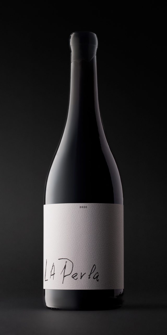
La Perla
One of the defining attractions of El Capricho—and undoubtedly the source of its unique character—is that it is an author’s work. All its products, activities, and daily life are permeated by the presence and involvement of its creators: today José Gordón; before him, his father; and originally, his grandfather, Segundo. They are the ones who excavated the cave that now houses the restaurant, who buy and care for the oxen, who planted the vines, and who make the wine. Everything is intertwined with their experiences, their emotions, and their passion for what the land provides—for authenticity.
This wine is made from grapes grown in the highest vineyard planted by the grandfather. It was José’s father, deeply enamoured with this wine, who gave it its name by writing on the barrel: La Perla.
The packaging of El Capricho can only serve as a showcase for this increasingly rare quality of authorship, personal effort, and authenticity. Everything else is superfluous.