

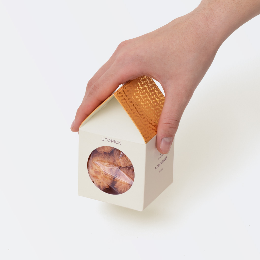
The Little Houses of Utopick
Paco Llopis is a Master Chocolatier, constantly exploring new possibilities in flavour, quality, and texture. He is deeply involved in the world of bean-to-bar production, creating chocolate from cocoa beans that he personally selects and sources in Colombia and other Latin American countries.
We had previously designed the packaging for the brand’s bean-to-bar tablets, and the next step was to create a box for its chocolates and cookies. One of the key requirements was that the packaging be environmentally responsible.
We developed a cardboard box adaptable to two different capacities, designed to meet the main objectives set out in the brief: it had to work as an attractive gift, stand out on the shelf, and—ideally—not be discarded immediately. Instead, it was conceived to remain in the customer’s home, both to enhance sustainability and to extend its visibility over time.
The proposed design takes the emblematic form of a small house (casita), featuring a circular window that reveals the product inside. Colour is limited to the roofs and follows a scheme consistent with that already used in the brand’s bean-to-bar chocolate packaging. These little houses also offer an added value: once the product has been consumed, they can be reused as toys or as decorative objects in children’s rooms, thereby extending their useful life.
The boxes are made from recycled cardboard.
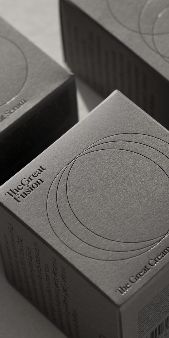
The Great Fusion
This was a global project in which all the brand’s communication elements were developed: naming, logo, visual identity, packaging, photography art direction, and website (web development by Nectar Studio).
The Great Fusion is an indie beauty brand that views the individual as a whole, offering products designed to promote calm and inner peace by acting on the skin—so that external care also becomes a moment of personal balance and inner well-being. The brand is the result of combining traditional botanical knowledge with advanced technology, bringing together three key ingredients: hemp, cica, and oats.
The main graphic element of the packaging design consists of three circles that merge, emphasising the union of these ingredients. These circles also function as a recurring graphic device across the brand’s printed materials, website, and social media. The circle represents perfection: it both highlights and isolates, and is often used as a visual counterpart to the brand’s discourse, drawing attention to what is essential and reinforcing key messages.
The logo is structured across two lines, separating the two core concepts—Great and Fusion—and is set in the PP Eiko typeface, which is also used consistently throughout the brand’s communications.
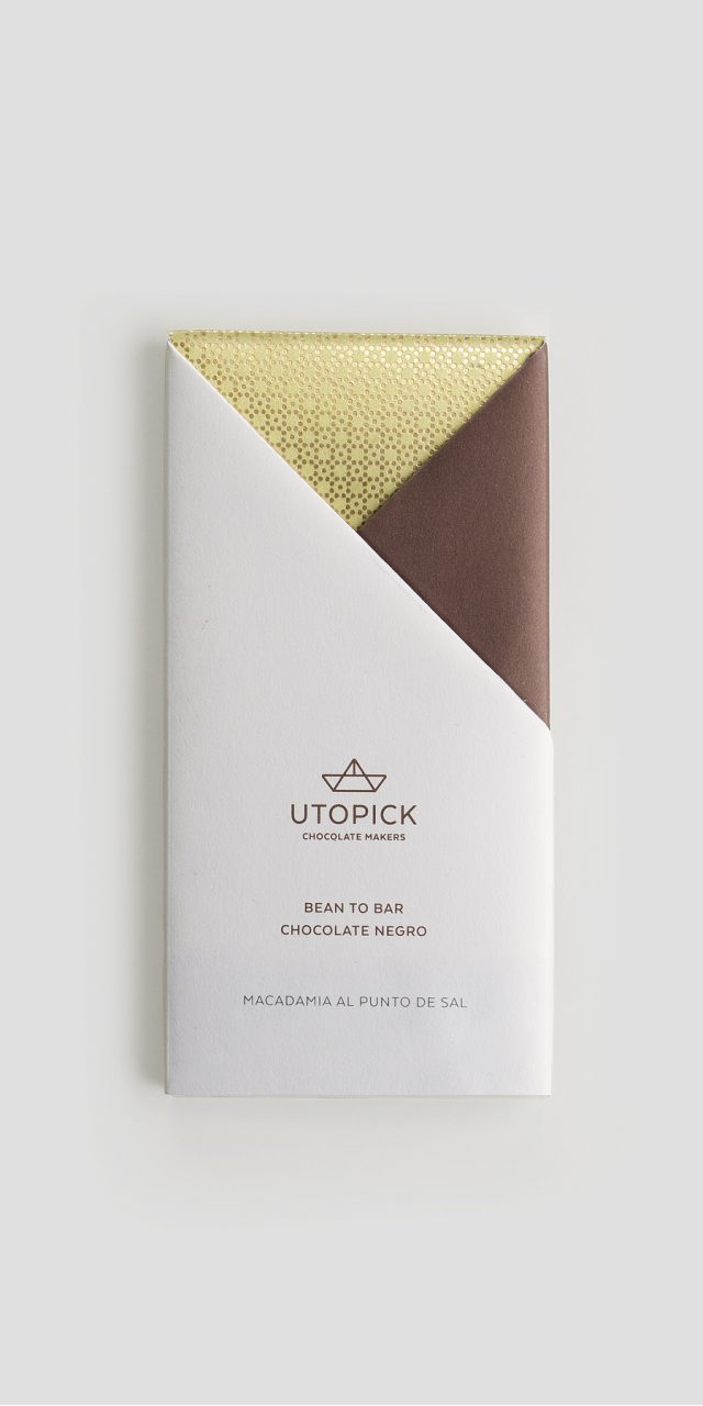
Utopick Chocolates
Paco Llopis is a Master Chocolatier—an ingenious craftsman constantly searching for new discoveries in flavour, texture, and filling techniques within the world of bean-to-bar production: an artisanal practice carried out entirely under the maker’s control. In this case, it involves using selected cocoa pods sourced directly from local producers in Colombia and other Latin American countries.
He came to us with the challenge of creating a new design and distinctive packaging capable of clearly communicating who he is and what he does—in other words, a design that embodies invention and creativity.
He already had a name for his product: Utopick—perhaps a reference to the creator’s pursuit of unattainable perfection, and at the same time a play on words: you to pick.
He also had a symbol: a ship, embodying the spirit of adventure and representing the long journey cocoa pods undertake to reach the chocolatier—the same route once taken by Spanish explorers when they first brought cocoa back in the sixteenth century.
As we explored how to package the chocolate, we transformed this symbol into an origami boat, marking the moment our solution was born.
Utopick packages its batches by hand, so we developed a unique paper-folding system to wrap the bars. This hands-on process is pure and authentic, embracing the traditions of skilled craftsmanship free from the constraints of automation.
The paper folds create two triangles on the front of the design, each with its own colour and texture, giving every bar a distinctive character.
The packaging opens and closes in a way that makes it easy to rewrap the chocolate, allowing it to appear untouched (it is well known that some people like to keep their chocolate indulgence discreet).
The same geometric forms are reproduced on the chocolate itself, which is pre-cut into large triangles—once again drawing on the ship’s geometry, the defining symbol of Utopick.
A paper ship that has travelled from afar.
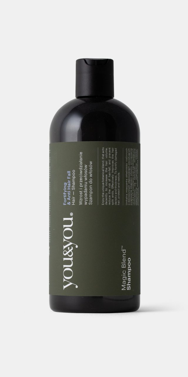
You&You
This project involves a young Polish company, RJ1, headquartered in Warsaw, which offers oral and body care products. In just a few years, the brand has expanded its presence across most European countries.
You&You products are the result of a blend of science, passion, and emotion, developed using natural ingredients with an environmentally conscious approach. The brand’s positioning leans closer to the health segment than to beauty, a distinction that is clearly reflected in the design. Both the choice of a standard bottle—following the traditional magistral formula packaging style—and the graphic solution reinforce this positioning.
References to the primary ingredients are illustrated on the back of the boxes, while the front adopts a sober typographic approach, avoiding striking colours or imagery and prioritising credibility over the conventional visual language of fashion or beauty products.
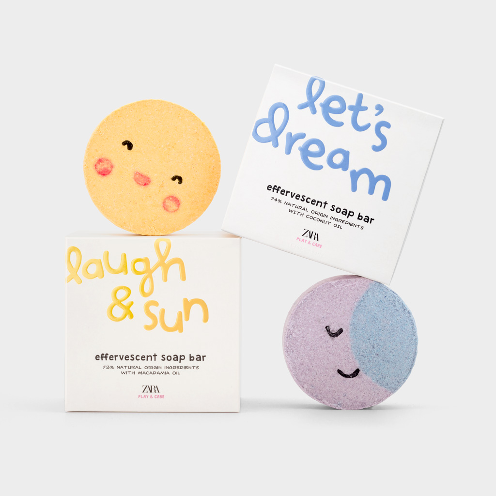
Zara Play & Care
The client asked us to design a line of hygiene products—soaps and effervescent bath bombs—aimed at children. The brief went beyond the graphic design of the boxes to include the design of the products themselves.
Each piece features a short phrase of two or three words, referring to the playful and imaginative dimension of the product. These phrases were conceived as a way of creating an emotional bond, which is why we chose to give them strong visual prominence.
The selected typeface is calligraphic, clearly childlike in character, and set in bright colours on white backgrounds. To further enhance their presence, the phrases are embossed with a glossy varnish. In contrast, the rest of the information—such as the product name and characteristics—is presented in black, avoiding an overly naïve result. These are not toys, but hygiene products designed to make the bathroom a more appealing and enjoyable space for children.
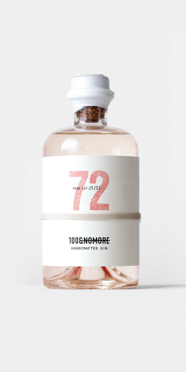
100&NOMORE
A new brand producing gins with distinctive flavours required a name, positioning, and visual identity. The essence of the project lies in its exclusivity, with batches limited to 100 numbered bottles for each flavour. The starting point was to find a name that would convey this quality and give rise to a story.
The narrative tells of a Dutch sailor, Andreas Van Loy, sent by the Dutch East India Company in search of a berry from which to produce a curative gin, capable of alleviating the pandemic ravaging the Netherlands. After two years sailing the Java Sea, just as he is about to return empty-handed, he discovers the long-sought fruit, fills the ship’s holds, and begins the journey home. Storms, pirates, and the harsh conditions of the return voyage, however, decimate the cargo. Upon arriving at port, it is discovered that only a handful of berries remain in good condition. The Prince of Orange, dismayed, declares how many bottles of gin they will be able to produce: 100&NOMORE!
The label, non-adhesive and held in place with a rubber band, features the batch number as its central element. On the reverse, a text describing the corresponding gin flavour can be read through the glass. The bottle is sealed with wax and presented in kraft cardboard boxes of one or three units, which also function as shipping boxes. As the product is sold online, this solution avoids the redundancy of placing one box inside another.