


Extrem Deluxe
Extrem, a new Brand of Iberian, acorn-fed ham has been launched by Agriculturas Diversas, a Spanish company with a long tradition in the premium ham sector. Extrem needed prestigious new packaging for their top product that could be bought as a special gift as the brand positions itself in gourmet shops around the world. The packaging needed to transmit the product’s extremely high quality to put it on par with other delicacies at the high end of the gourmet world, such as caviar and foie. We designed the packaging in matt black, with a contrasting golden pig handle. An elegant serving tray in which to present the finest cuts of Iberian ham “comme il faut.
Client: Gallén-Ibáñez and AGR! for Agriculturas Diversas SLU.
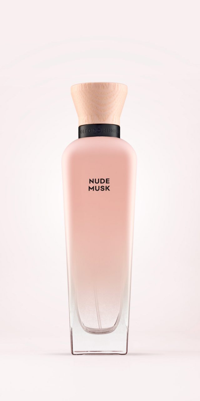
AD Musk
The task was to design a new line of women’s fragrances for Adolfo Domínguez with a twofold objective: to convey the spirit of the new scents—based on musk as the main ingredient—highlighting sensuality and naturalness; and to provide a sustainable packaging solution.
Drawing on the iconic Agua Fresca bottle, developed in a refillable format (both regular and refill), a bespoke wooden stopper was designed with a natural finish to add warmth. In terms of finishes, the bottle features a thin layer of matte paint that gradually fades from the shoulders until it disappears towards the lower section, revealing the transparency of the glass. The collar, where the stopper sits, incorporates the brand’s logo engraved in matte black bas-relief.
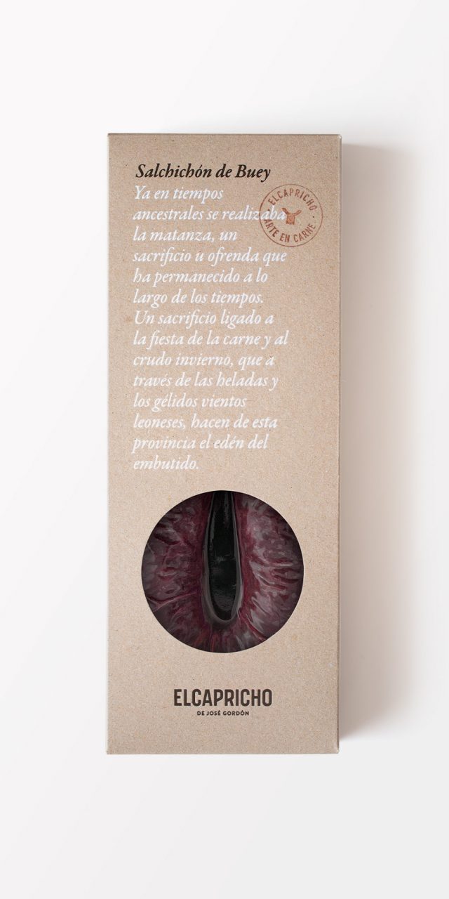
El Capricho
El Capricho is a renowned restaurant specialising in beef. Gourmets from across Europe, Japan, and the Americas make the pilgrimage to Jiménez de Jamuz, a small village in León, to savour the extraordinary experience of dining in this temple of what is considered the finest meat in the world, carved into the mountainside.
The packaging design seeks to combine tradition and innovation, fusing the austerity of traditional materials with bold graphic design to reflect the powerful, honest, and singular identity of El Capricho. The use of materials such as handmade cardboard, wood, string, and cloth for a gourmet product not only conveys values of authenticity, terroir, and tradition, but also creates a surprising and distinctive consumer experience. The notion of a signature product is expressed through quotations from José Gordón himself—the driving force behind El Capricho —which speak of a history shaped by generations.
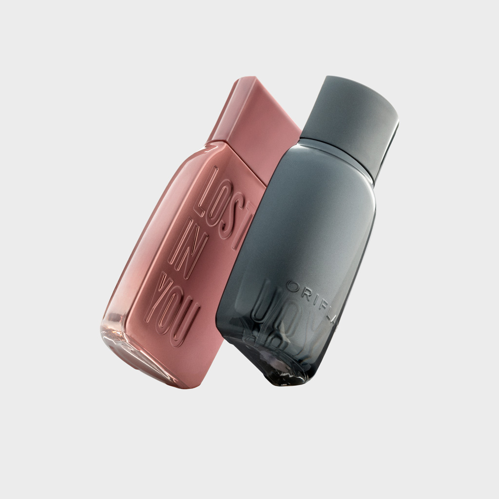
Lost in You
The client asked us to design a bottle for a masculine and a feminine fragrance that would convey the idea of a couple—of love and seduction—while appealing to a young audience (millennials).
The name of the perfume, Lost in You, is taken from the lyrics of the well-known song I’m Addicted to You by DJ Avicii.
The solution took the form of a design composed of two halves of a single bottle, an idea that reinforces the concepts of partnership and attraction. Lost in You is embossed directly onto the glass, and each bottle features a metallic finish that fades from opaque to transparent.
Project developed in collaboration with Glow Brand Design.
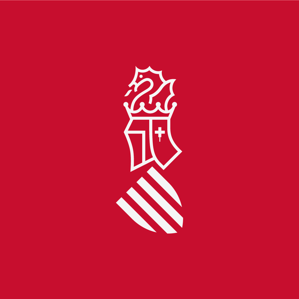
Generalitat Valenciana
In 1985, the Generalitat commissioned La Nave studio to design the institution’s symbol, based on the helmet of Peter IV of Aragon. More than 30 years later, the decision was made to update the symbol, and the same authors—Nacho Lavernia and Daniel Nebot—were recommissioned.
The typography was replaced with a far more legible typeface, deliberately detached from passing trends. The symbol itself was harmonised by equalising line weights, giving greater presence and solidity to the tilted shield, and by removing elements that, due to their small scale, caused reproduction issues.
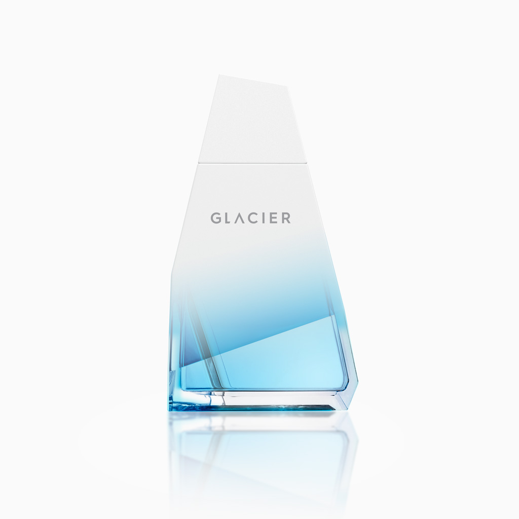
Glacier
Glacier is a fragrance line created for men drawn to risk and adventure. The name itself clearly refers to untamed nature. The faceted shape of the bottle, with its sharply defined edges, evokes an iceberg or a rock, while the finishes distinguish each of the three fragrances.
The result is an organic yet distinctly masculine form, combined with bold colours that represent different challenges found in nature—as defined by the brief.
Project developed in collaboration with Glow Brand Design.