

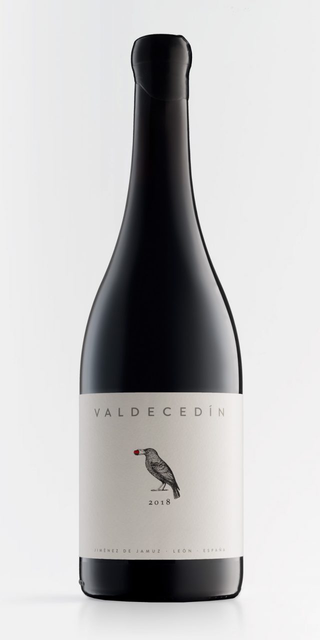
Valdecedín
The rise of storytelling presents a challenge for thousands—if not millions—of companies that, in all honesty, have very little to tell. A delicate situation, and one entirely opposite to what we encountered when we became acquainted with El Capricho. It is not that they have a story; rather, they are the epitome of storytelling.
Every gram of their products, every square metre of their facilities, and every detail of their business carries a story behind it—stories rooted in family, individual effort, the dreams and bold ideas of an ancestor, deep knowledge of tradition, and respect for the land, for animals, and for nature: the finest raw material for the finest storytelling.
For this reason, when we designed the label for this wine, all we needed to do was listen to what they had to tell us. And so we drew a starling with a cherry in its beak. As always, there is a family story behind it—memories that go back three generations and that, in this case, are told on the back of the label.
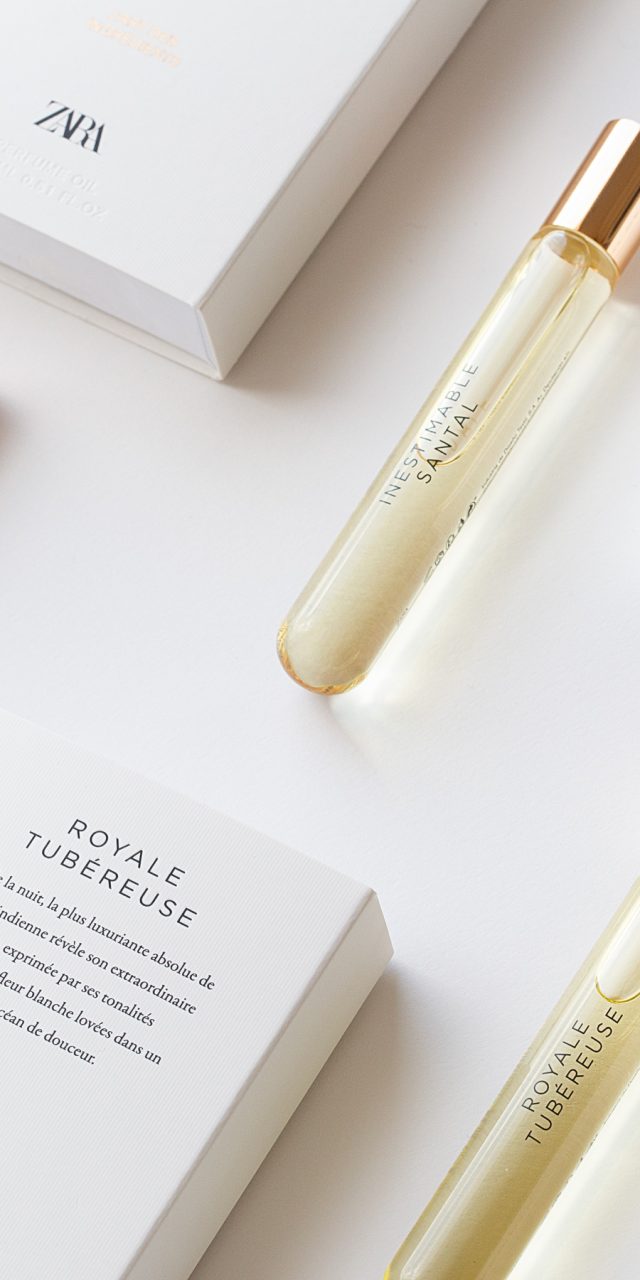
Zara l’Art des Ingrédients
The Egyptians used oils infused with flower extracts as perfume. Many centuries later, the mastery of techniques such as distillation led to the widespread use of alcohol-based fragrances. Yet, in a way, the Egyptians were right: oil-based perfumes offer a number of distinct advantages. They moisturise the skin, retain scent for longer, are safe when exposed to the sun, and tend to last longer once applied.
In addition, the small size of the bottle makes it easy to carry at all times. The design deliberately moves away from that of a conventional fragrance, both in the glass bottle—shaped like a test tube—and in the packaging, which relies solely on typography arranged in an elegant and restrained graphic composition. All elements are printed on textured card, lending the product the premium look and tactile quality requested by the client.
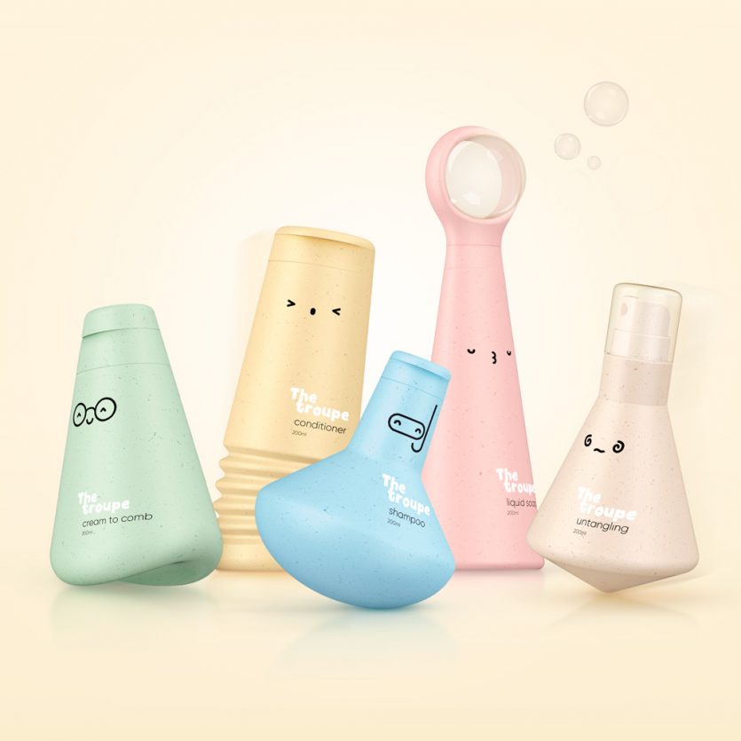
The Troupe
This is a line of bath products for children conceived as a sustainable solution, both through the use of recycled PE packaging and through the life of the containers beyond the product’s actual use. Play is at the heart of the concept—play during bath time, and play afterwards, once the products have been used, extending their lifespan.
The idea was to create a group of characters, conceived as a troupe of circus performers, each with its own distinctive skill: the detangling spinning top, the shampoo submariner, the liquid-soap bubble builder, the conditioner jumper, and the cream roly-poly toy. Five characters designed to turn the bathtub into an aquatic circus ring, transforming it into a playful and beloved troupe that children can enjoy for a long, long time.
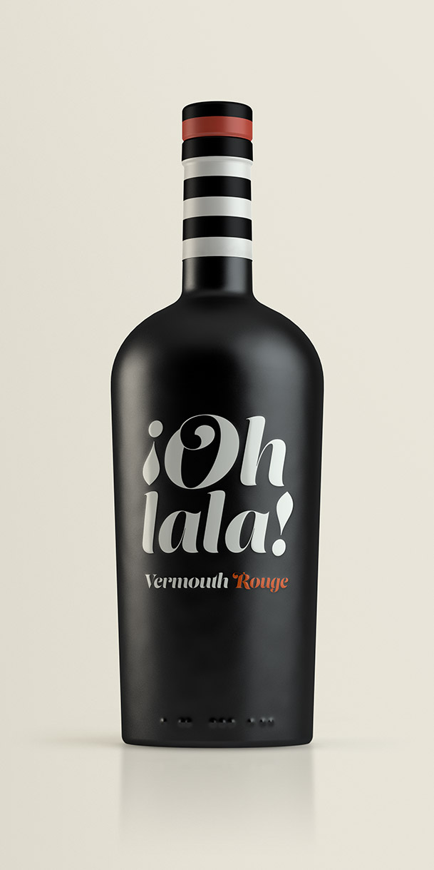
Ohlala!
We were given the name, and with a name like that, the image that immediately came to mind was that of a seaside bistrot or one set on the square of a small port town on the Côte d’Azur. Along with it came the quintessential image of a French woman in a striped sailor-style top, perhaps wearing a scarf or a red beret.
Sometimes the evocative power of a name is the key to the entire design: it is capable of telling a story, of suggesting a scene. A young woman sitting at a table, asking for un vermouth rouge, s’il vous plaît, and an attentive garçon who replies—or perhaps thinks—Oh là là!
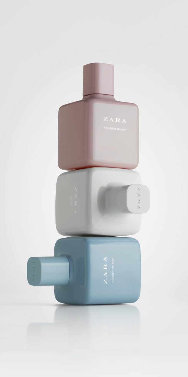
Zara Woman
Zara approached us to redesign its best-selling women’s fragrance range. The brief called for an evolution of the existing design, ensuring that customers would continue to recognise the collection. Our focus was placed on the bottle and the cap, while only minimal changes were made to the secondary packaging.
Previously, the bottle featured a cubic design with very pronounced edges—an aesthetic that has become commonplace in the fragrance market—and a cylindrical cap. We began by working with square forms, while also searching for that defining element that would give the design character. The edges were softened, the faces subtly curved, and a transitional joint was created between the bottle’s shoulders and the cap, making the latter appear as a seamless continuation of the glass. The cap itself was also redesigned with a rounded square shape.
The result is a smoother, more feminine appearance than the previous design, while also conveying a higher perception of quality thanks to the increased weight of the bottle. The range comprises seven fragrances, divided into two groups: one with clear glass and black caps, and another featuring the more sophisticated variants, with tinted glass in black, red, or white.
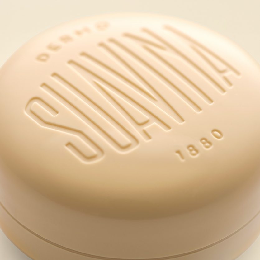
Suavina
Suavina is a lip balm with a long history behind it—“135 years taking care of your lips”, as the brand’s baseline states. The design reflects a classic product imagery, in line with the main requirement set out in the brief.
The packaging design of the lip cream container is a redesign: an updated version of the container the brand has been using for many years. The surface has been softened and the edges rounded to convey the sense of smoothness expected from this type of product. The lid features the brand name, redesigned from the original identity, and also includes the word demo together with the brand’s year of foundation: 1880.
The design solution seeks to balance tradition and modernity through the use of classic typographic composition, sans-serif typefaces, and debossed lettering.