

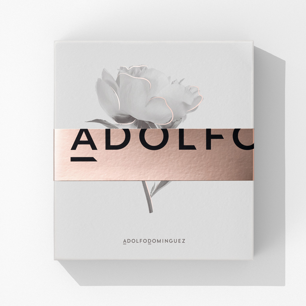
Adolfo Domínguez
Perfume gift boxes are a widely used sales tool. Alongside the fragrance itself, they typically include complementary products such as aftershave, body lotion, or deodorant in the same scent. They encourage purchase through a dual incentive: price—always more advantageous than buying the items separately—and the appeal of the gift itself.
This gift condition takes precedence in the design, defining a series of visual and perceptual qualities. The packaging must be suggestive and attractive, as it is conceived primarily as a gift; it is also intended to be kept and reused. The presence of a floral image conveys delicacy and alludes to the fragrance within. Golden strokes accompanying the black-and-white imagery, together with the austerity of the composition, lend a sense of distinction.
This is further reinforced by the discreet presence of the brand, deliberately distanced from any overt promotional intent (the design was developed in close collaboration with the client’s marketing team). The suggestion of humility implied by the box’s modest size becomes, in itself, a statement of confidence in the brand’s prestige.
This idea is echoed in a different way on the sealing strip—intended to be discarded once opened—where the brand name appears in large but incomplete lettering, subordinated to the restrained elegance expected of any truly well-considered gift.
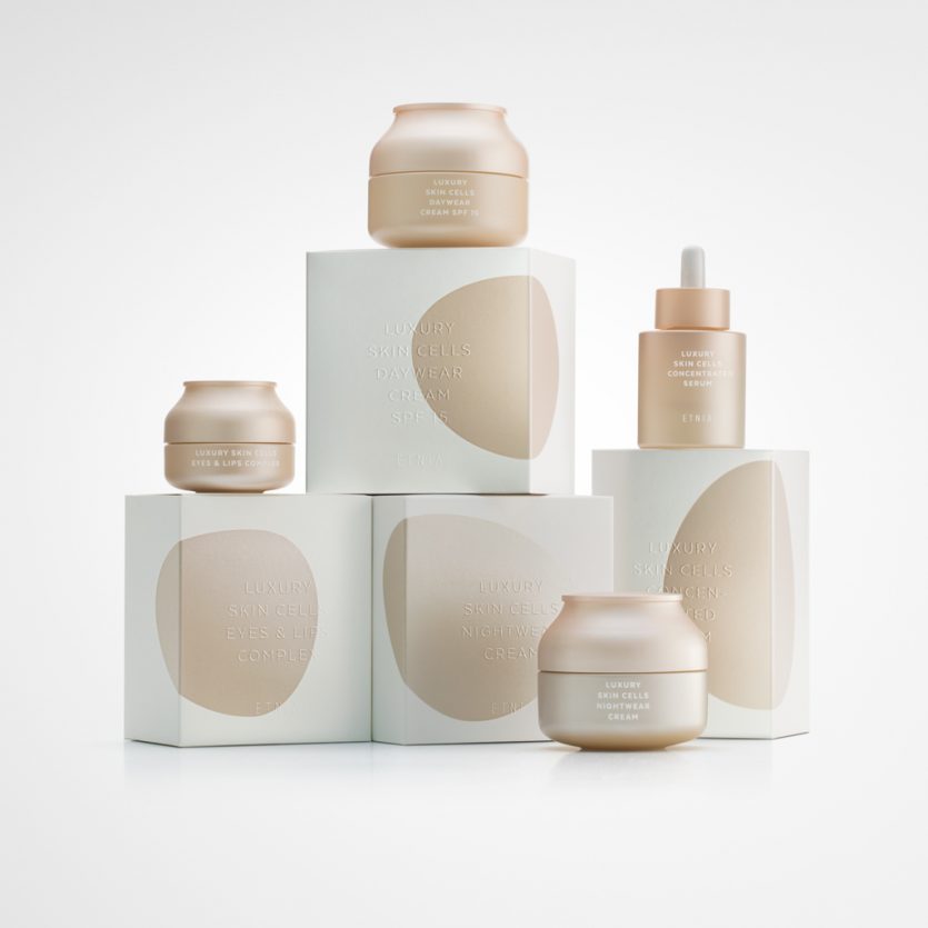
Luxury Skin Cells
The main objectives were to create a visual identity with a distinctive personality, consistent with the product’s quality standards and the concept behind the Luxury Skin Cells range, while conveying values of elegance, sophistication, gentleness, and exclusivity.
Finishes such as stamping, embossing, gloss, and metallic effects are typically applied as additional resources to enhance a product’s premium appeal. In this case, however, the concept was to make these finishing techniques the core elements of the design and layout. On the one hand, an organic metallic shape evokes the idea of cells and is subtly transformed on each box to personalise the different products within the range. On the other, the text is blind embossed, without ink, allowing the “cells” to become the main focal point of the design.
The jar was designed with colours and forms that are fully aligned with the overall aesthetic of the range.
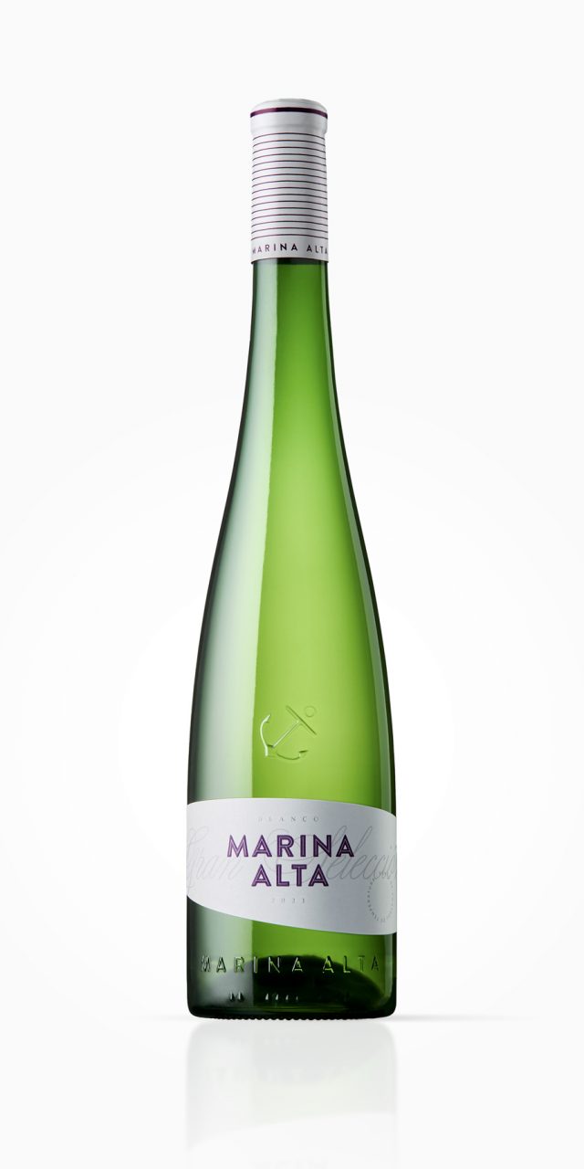
Marina Alta
The brief was comprehensive: to design a new bottle and new graphics for Bodegas Bocopa’s best-known and best-selling wine. For this reason, it was essential to maintain a clear connection with the previous design. Regarding the bottle, two fundamental requirements were set. The first was to reduce the weight of the glass to below 600 g (in some export markets, heavier bottles are either not permitted or subject to environmental taxes). The second was to preserve the height and typology of the former bottle: Rhine-style, slender (unlike Burgundy bottles), and without shoulders (as opposed to Bordeaux bottles).
To achieve a lightweight bottle, highly original or disruptive forms had to be avoided, as such shapes—often asymmetrical or featuring irregular surfaces, engravings, or reliefs—require a greater volume of glass and make weight reduction unfeasible. The proposed design weighs under 540 g. The elegance of the bottle lies instead in its proportions and in the harmonious interplay of curve and counter-curve that defines the transition from the body to the neck, subtly distinguishing it from other Rhine-style bottles.
The graphic language begins at the capsule, featuring a striped pattern that evokes a nautical aesthetic. It continues with a bas-relief anchor on the glass and concludes with a narrow label whose curved upper and lower edges suggest the sails of a ship or the movement of the sea. A bold, powerful sans-serif typeface counterbalances the softness of the bottle and label, ensuring that the brand—already well established in the market—remains the focal point of the design.
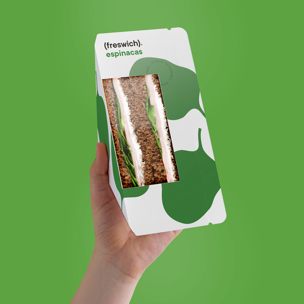
Freswich
What should you call a sandwich brand that stands out for the freshness of its ingredients? Freswich. It may seem obvious, but it is often the most obvious ideas that work best—and when it comes to the demanding art of product naming, this is a golden rule.
This desire for clarity and simplicity led us to create a logo in which the word freswich—written in lower case, true to the humble simplicity of a sandwich—appears within parentheses. These parentheses act as an immediate visual metaphor: they recall both the shape formed by the slices of bread that enclose a sandwich and the brief pause in time we take to stop what we are doing and enjoy a bite.
The symbolic image of the main ingredient is rendered in a single colour against the background—white for the basic range, beige for the vegan range, and black for the Chef range. This system helps to clearly identify each variety while keeping the front of the pack clean and uncluttered, emphasising the transparent window through which the sandwich reveals its contents.
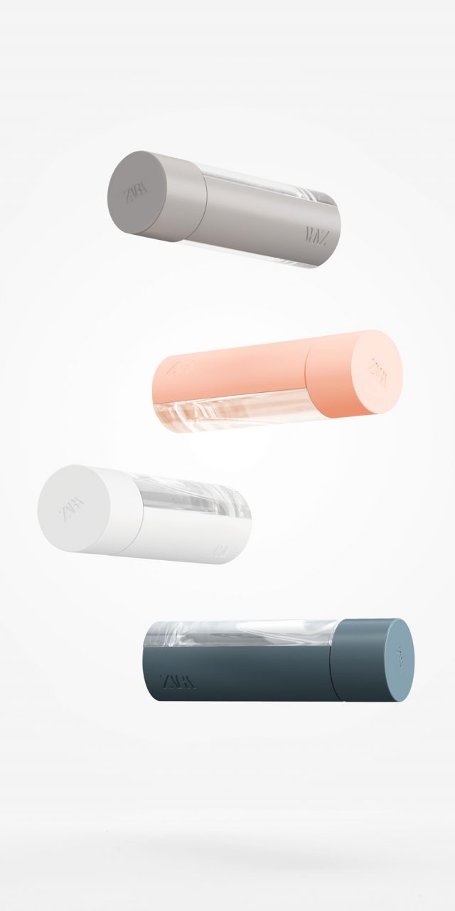
Zara Fragrances
The brief called for a unisex container, featuring a subtle touch of colour in the glass and offering the possibility of customisation for special editions. The fragrance is aimed at a young audience, and the concept placed strong emphasis on minimalism.
We designed a cylindrical bottle—an elementary, timeless form—featuring two recessed areas into which two opaque components are fitted. This structure divides the bottle into four sections: two transparent and two coloured elements that can be interchanged to create different versions. The lid, also cylindrical, acts as a natural extension of the body and is finished in the same colour.
Random
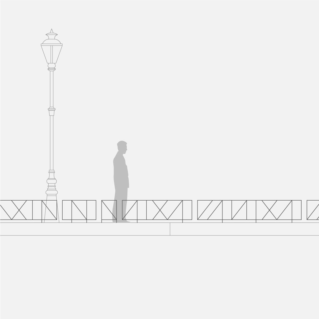
There are two key qualities that define street furniture components: utility and integration. The primary function of this fence is to protect specific landscaped areas from being walked on or accessed by dogs; as such, it must meet certain basic requirements in terms of height and the size of its openings. However, another functional aspect was equally important to us—one related to manufacturing and installation.
To simplify both processes, we designed the fence as a system of modular elements installed with small gaps between them. This allows it to adapt precisely to the dimensions of the area to be enclosed, without the need for on-site welding or custom-made components, while also offering the flexibility and visual richness provided by a wide range of possible configurations.
Integration into the urban environment was a major concern. We believe that such elements should blend naturally into the cityscape, avoiding visual dominance and instead harmonising with the surrounding architecture. This was especially important given the abundance of metal handrails, guardrails, and balustrades—often in very different styles—that coexist in any urban setting. For this reason, we opted for a simple, discreet design based on straight lines, achieving integration while offering greater visual interest than the repetitive, conventional barred railings so commonly found. The subtle variations between modules allow fences to be created without repetition, introducing a sense of rhythm and continuity.
The interplay of vertical and oblique lines generates a perception of movement as the observer walks past, while the slender profile of the bars makes the fence almost invisible when viewed from a distance—where its presence as a physical barrier is no longer required.