

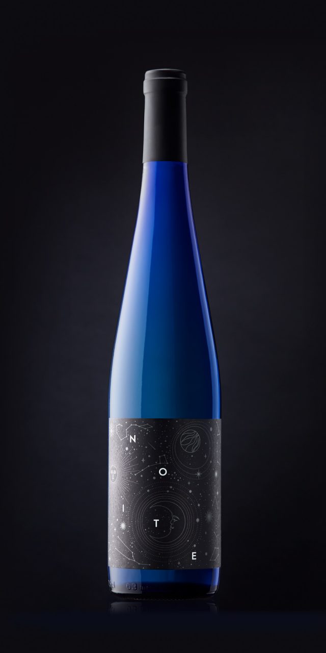
Noite
When we design a label, the first step is always to look for an idea that suggests an image or a point of departure for the project. Sometimes this idea emerges from the brief; at other times, from the origin or characteristics of the wine itself. Occasionally, it comes from something external—such as the moment in which the wine is enjoyed: a summer night, a hammock on the terrace, a glass of Albariño, and a dark sky filled with stars.
Everything is calm, and there, floating in space, five letters say it all: NOITE.
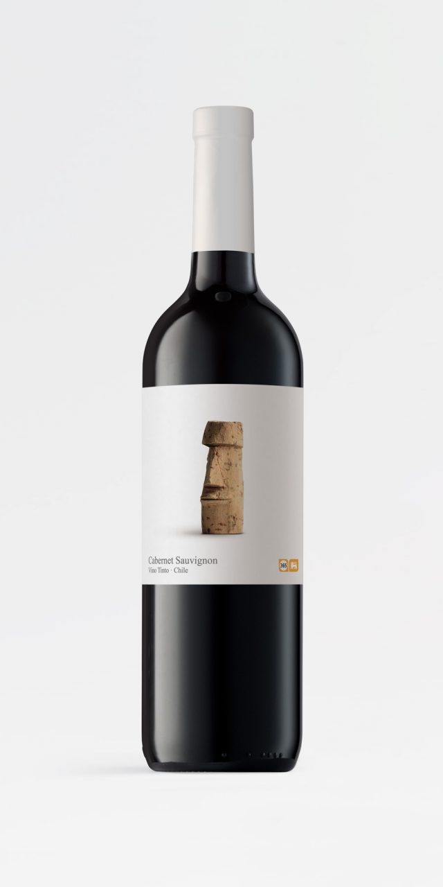
Wines of the World
This is a range of wines offered by the Belgian supermarket chain Delhaize under its own-brand label, 365, which brings together simple, everyday products at affordable prices. The cork serves as a symbol of humility: an object of little intrinsic value, often used in crafts, appreciated for its simplicity and ease of manipulation—as something with which to play and create.
The use of cork lends the range an unpretentious, everyday character. The cap becomes the unifying and personalising element across the entire collection, while the motif designed for each label refers to the wine’s country of origin.
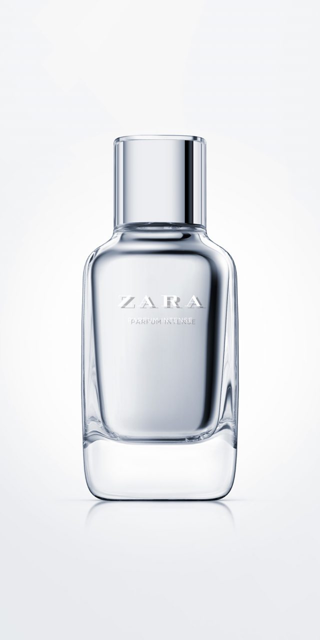
Zara Parfum Intense
This is Zara’s top fragrance range. We designed a bottle with a rounded square cross-section, in line with the basic range, featuring a smooth and seamless transition between the shoulders and the neck. It is made of heavy glass, characteristic of premium fragrances, and features painted inner walls, giving the bottle the appearance of having two skins: a transparent outer layer and an inner layer in silver (later versions were produced in other colours, such as red or pink).
The lid was designed as a continuation of the neck and finished with a transparent outer cover, creating the same double-skin effect as the body of the bottle.
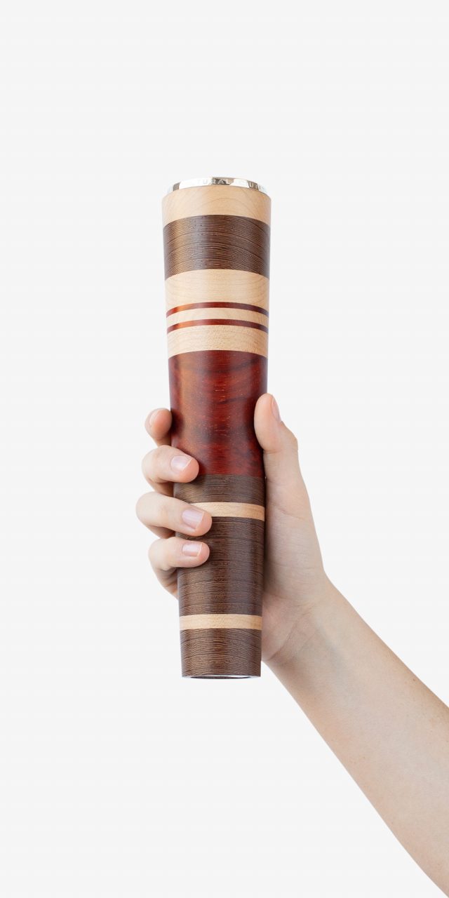
Award for Cultural Merit
When reflecting on the shape a trophy should take, we realised that it must be designed to be held in the hands and raised in celebration of victory. That is why large cups traditionally have handles. Thinking of someone with their arms lifted, the image of a torch emerged naturally—and it immediately resonated with us. Not only does it have the right form, but it also symbolises light, the pursuit of truth, knowledge, and culture. We chose to craft it in wood, a living and noble material—much like culture itself.
Wood is also deeply rooted in Valencia. The city has a long tradition of furniture makers, cabinetmakers, and turners, as well as a strong history in the trade and distribution of wood from around the world. This heritage also extends to the making of musical instruments such as the dolçaina, so closely associated with Valencian music. Why not, then, turn different types of wood on the same torch? It becomes a way of alluding to culture as something built layer by layer, year after year, generation after generation. And why not make each one slightly different from the others, so that—while remaining the same trophy, the same prize—each piece is unique, just as every award recipient is unique?
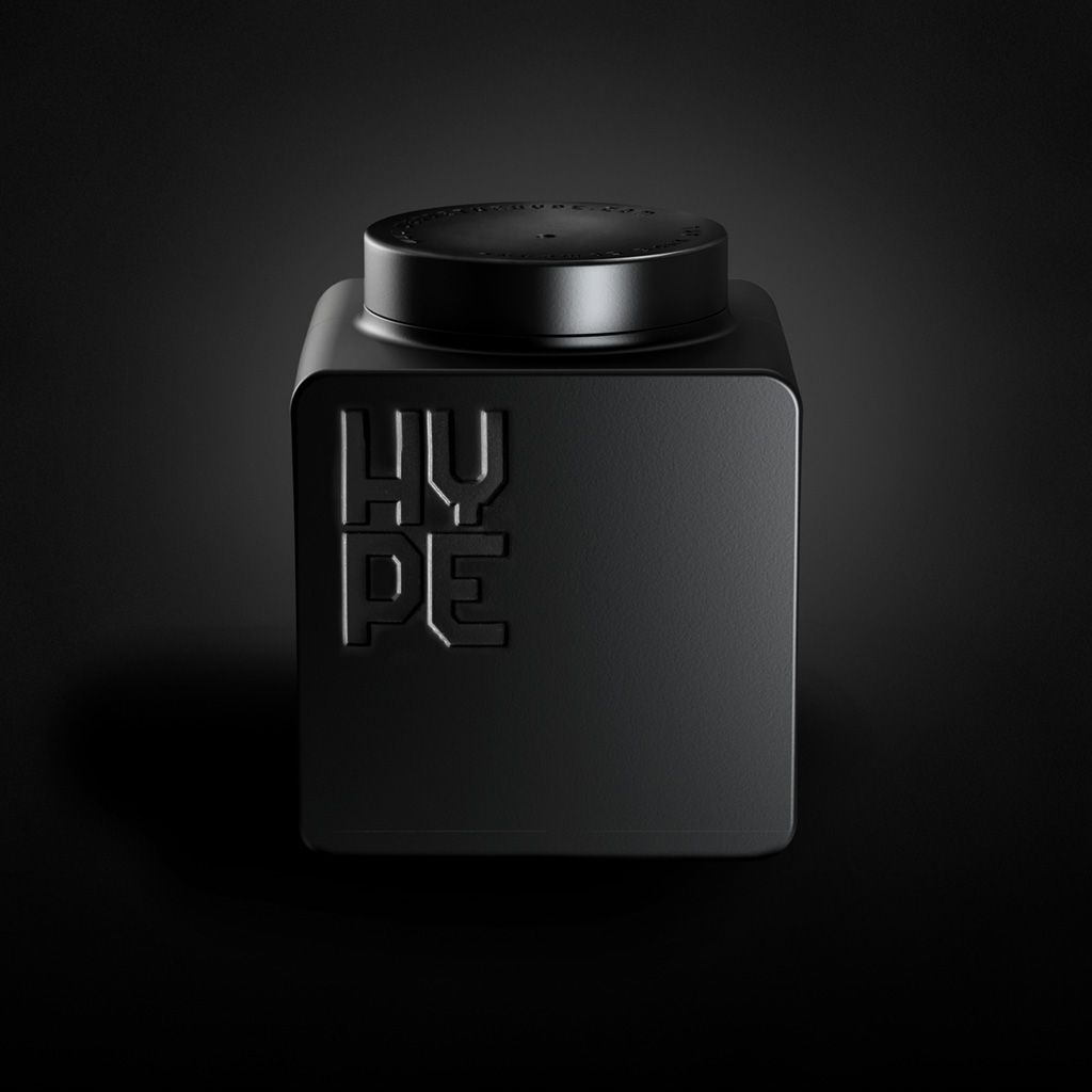
Hype
The Hype Company is a fertiliser manufacturer and an expert in biotech treatments based on natural sources. As an addition to its catalogue, the company’s R&D team developed an innovative product line focused on cannabis cultivation.
The brief called for a liquid fertiliser container that could be reused as a receptacle once empty. It is aimed at a young, modern audience who care for their own urban gardens and are just beginning their journey in agriculture. The container was also required to be stackable, with specific constraints regarding the diameter of the opening and the closing cap.
The result is a cube-shaped container reminiscent of classic construction-set blocks, optimising logistics for both the manufacturer and the end user.
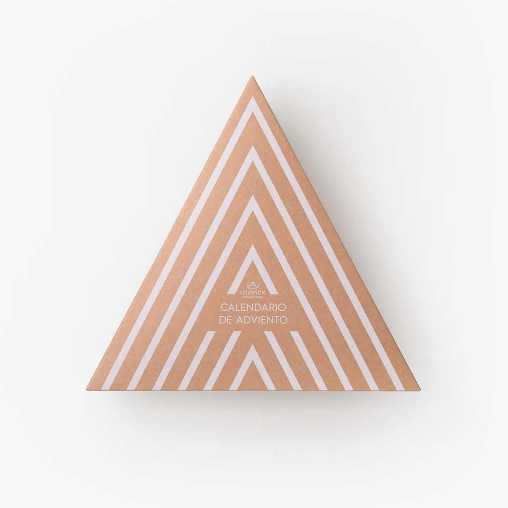
Utopick Adviento
Advent calendars have only recently arrived in Spain, but they have done so with great impact. Companies see them as an opportunity to connect with their end customers by appealing to emotion and offering a pleasurable, engaging experience.
The triangle dominates the entire design of the Utopick calendar, firstly because of its link to the brand—a small paper boat made of triangles—and secondly because it echoes the shape of a Christmas tree. The calendar comes in a triangular box containing 24 smaller triangular boxes, decorated with golden geometric patterns that transform them into Christmas ornaments.
That is precisely what they are: designed to hang on the tree, giving them a longer life than usual and a central presence throughout the festive season. Inside, delicious pieces of chocolate—created especially for the calendar with bespoke motifs—await the day marked on each little box.